
Read Manhattan Numerals: Find Each Facade's Voice
Three entrances turn ordinary addresses into clear visual identities. The route moves from polished downtown digits to Times Square repetition and a station-scale numeral, showing how type changes the way a building meets the street.
Three numeral systems to compare
Two digits, two weights
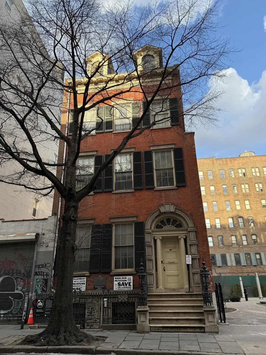
At 42 Broadway, a compact metal 4 and a broader 2 sit against dark stone beside the entrance. Their mismatched widths keep the address legible without making it ornamental. Compare the narrow first digit with the open curve that follows. The small shift in weight gives a formal office facade its own signature.

Four beats in neon light
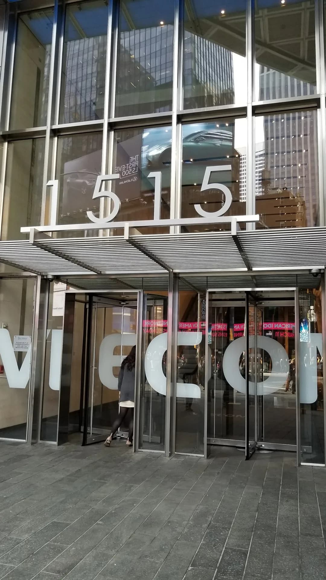
Across the glass entrance at 1515 Broadway, the address repeats in a tall condensed style. The sequence lands like a visual rhythm amid Times Square reflections and signs. Watch each pair hold its shape as the light and crowd move past. Repetition lets the doorway claim attention without competing through color.

A lone 2 in the glass
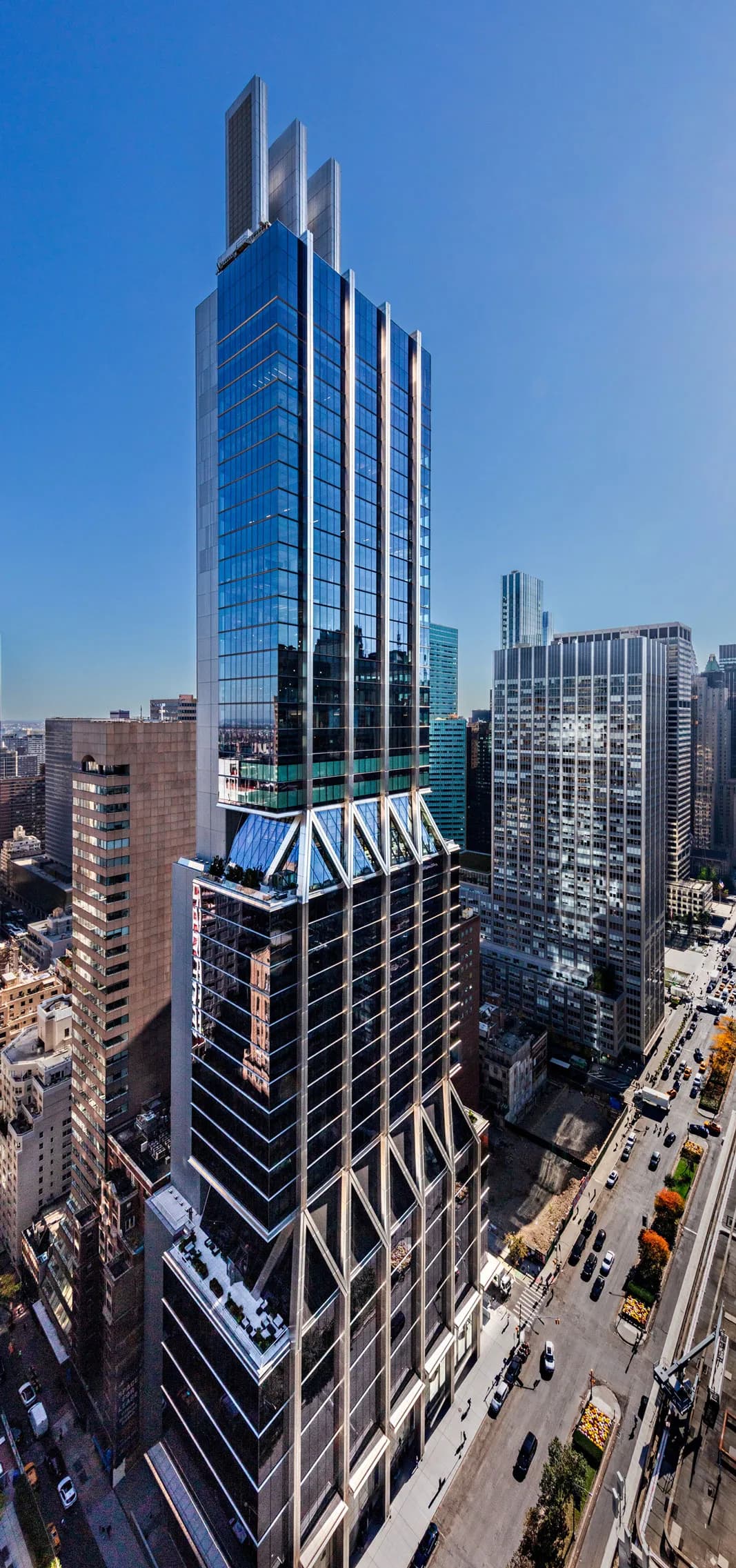
At PENN 2, a single white numeral sits inside the glazed corner above the station district. Its clean vertical and curved strokes read through reflections without competing with the facade grid. Find the 2 where the lower glass meets the angled supports. From across the avenue, that small mark gives the broad office block a precise street-level address.