 Chinatown New in Town Weekend Planner: Errands and Temples
Weekend Plans
Esplanade Panoramic City Lookout: Give Singapore 3 Colours
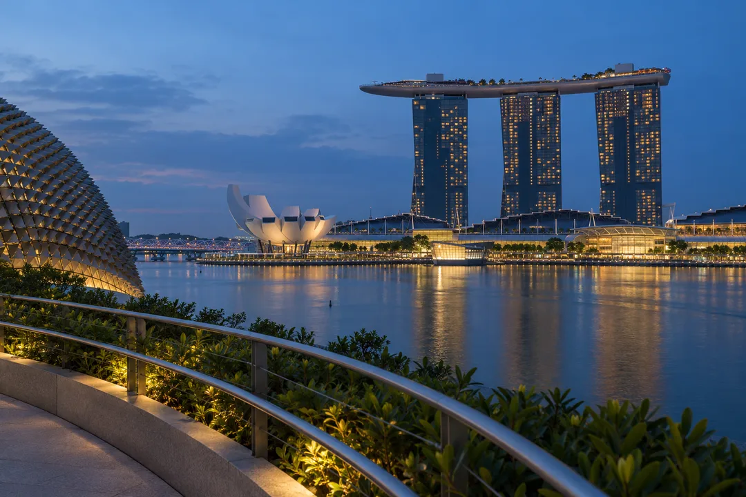
Esplanade's Roof Terrace pairs Marina Bay views with architectural texture for a Singapore colour study, turning a broad panorama into three chosen swatches.
Esplanade's Roof Terrace makes a panoramic city lookout into a colour exercise. Its own description pairs the city and Marina Bay outlook with planted surroundings, while its photography guide draws attention to the building's sunshade patterns. Choose three colours from that combination of distant water, built surfaces and nearby texture. The result can be a small palette for a drawing, a room, a piece of clothing or simply a remembered evening, without trying to capture the whole panorama in one photograph.
Choose the colour that occupies the most attention
Begin by looking without recording anything. Which colour feels most present to you? It need not cover the largest area. A subdued water tone may hold your attention more strongly than a bright building, or a patch of planted green may become the anchor around which the rest of the view arranges itself. Choose that colour as your base. Describe it with a familiar comparison, such as slate, bottle glass or washed denim, rather than searching for a technically correct name.
Those comparisons are personal tools, not fixed descriptions of the terrace. The bay will not present the same colour to every visitor, and the impression can change while you stand there. Let the choice belong to the view you encounter. If the water seems grey rather than blue, keep the grey. Forcing an expected postcard colour into the palette would make the exercise less observant, even if the finished set looked more conventionally tropical.
You can make a loose mark with a coloured pencil, or write the comparison in a notebook. Neither needs to be an exact match. A mark records an impression, while a note can preserve a difficult colour you cannot reproduce with the materials in your hand. Resist filling half the page immediately. The base colour needs to leave space for two other choices, and their relationship will matter more than the accuracy of any single swatch.
Add a smaller colour that changes the base
Next, choose an accent from a different part of the scene. If your base came from the broad bay, look towards a built form or a nearby detail. The accent should change how the first colour feels when they sit together. A pale warm mark can make a cool base seem quieter, while a dark green might bring out a blue you had barely noticed. You are testing a relationship on the page, with the city as the starting material.
Keep the accent visibly smaller. This is an editorial decision about emphasis, not a rule of colour theory you must obey. Two equally large swatches can feel like competing alternatives, whereas a small mark beside a larger field can suggest a place with one strong atmosphere and a brief interruption. Try moving the marks apart before deciding that they clash. A little plain paper between them sometimes preserves the difference that made them interesting outdoors.
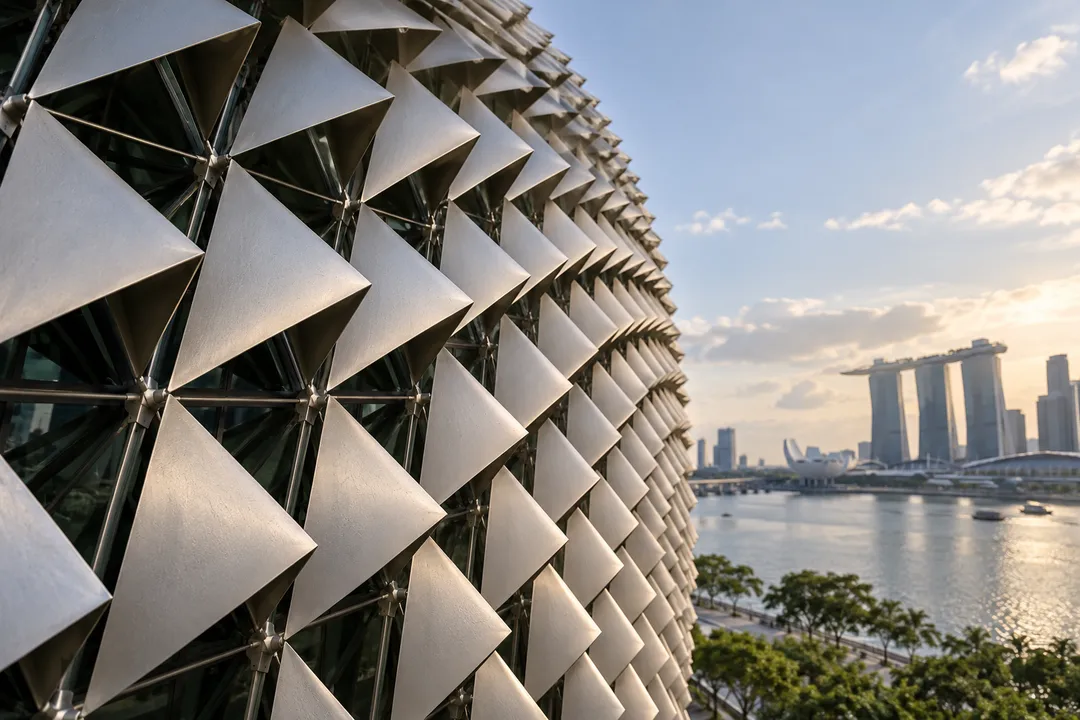
Esplanade's architectural surfaces offer a useful contrast to the water. The venue's photography guide highlights the repeating triangular sunshades, whose light and dark faces provide texture as well as colour. Notice the surface from a normal visitor position rather than trying to reach it. Choose an impression from what you can see. Metallic does not have to mean a uniform silver swatch, and a shaded face can be more useful to your palette than a bright reflection.
Make the third choice do a different job
For the last colour, look for something that connects the first two or deliberately keeps them apart. It may come from a shadow, a plant or a pale piece of sky. Avoid choosing another accent just because it is vivid. The third mark has a role: it can soften a sharp contrast, provide a quiet background or make the other colours feel more distinct. Test a tiny patch first, leaving most of the page untouched until you see what happens.
A practical example might begin with a grey water tone and a small warm reflection. A muted green could make that pair feel more grounded, while a pale blue might make it feel more open. These are hypothetical combinations, not a prediction of colours waiting at the terrace. Make your own decision from the scene. The value of the exercise lies in explaining why one third colour helps, rather than collecting an attractive set from somebody else's description.
Cover one swatch with a finger and compare the remaining pair. Repeat with each colour hidden in turn. This small test reveals whether the third choice actually contributes. If the palette becomes clearer without it, reduce its size or replace it. You are allowed to finish with a modest, restrained combination. The city does not become less interesting because your page has fewer bright marks, and the exercise does not need a dramatic transformation to have worked.
Take the palette into a conversation
Someone sharing the outing can choose a different base from the same outlook. Put your sets together and ask each other which part of the view the colours evoke. One person might remember the built texture, while another recalls the space across the bay. Explain your choices before comparing whose set looks more pleasing. The difference can uncover a detail you overlooked and give you a reason to look back at the panorama once more.
Try attaching the palette to an ordinary future use. Perhaps it suggests a postcard with a broad grey field and a small warm mark, or a notebook cover with a green edge. Keep this as an imaginative exercise rather than a shopping assignment. You do not need to locate products in matching colours to complete the outing. A concrete use simply makes you decide which colour should dominate and which can remain a minor note.
Practical Notes for keeping the colour record honest
Bring a compact kit you can hold together, and avoid laying loose pencils or paper across a passage. If you photograph the view as a reminder, let the picture accompany the swatches rather than replace your observation. A camera screen may make colours seem more saturated or shift their balance. Keep a note about which impression you selected in person. Later, you can enjoy the difference between the photographic record and the palette without declaring either one a perfect copy.
The terrace is a setting for this activity, not a promise of a particular light display, event or empty viewpoint. Work with the space and light in front of you, keeping other visitors' movement in mind. You can ask Karpo APP for another outing idea based on colour, architecture or a waterfront pause if those interests suit you. The page is already a finished result when its three marks have distinct roles: one holds the atmosphere, one interrupts it, and one makes the relationship yours.
Ask Karpo for more information.
Keep reading
- Chinatown New in Town Weekend Planner: Errands and Temples
 Kampong Glam New in Town Weekend Planner: Mosque to Murtabak
 Holland Village New in Town Weekend Planner: Meet People