 Brixton Vintage Thrift Shop Finder: South London Retro Gems
Hidden Gems & Odd Finds
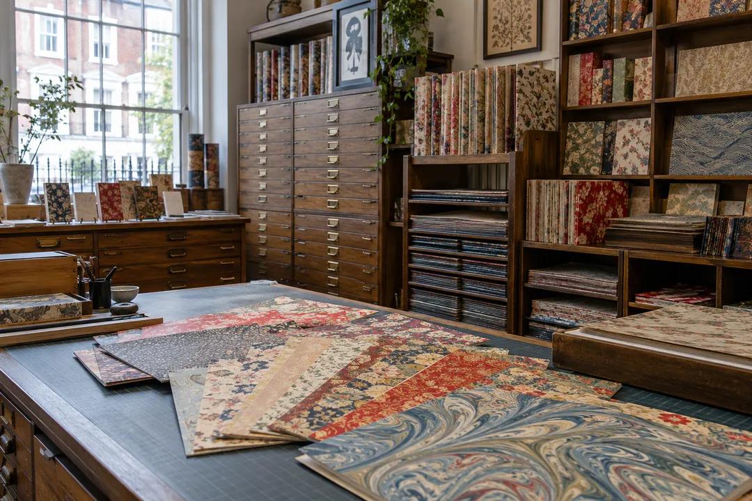
Traditional Calligraphy Supply by Victoria: Pick a Sheet
Shepherds near Victoria station stocks handmade paper, quills and inks for book arts. Match your colours to the right sheet before an illuminated project.
Shepherds is an established London book-arts and fine paper specialist near Victoria, renowned among scribes, bookbinders and marblers for its curated selection of handmade sheets, Japanese decorative papers, binding supplies, inks and lettering pens. For a traditional calligraphy supply outing centered on illuminated initials or formal text, visiting this paper studio before mixing pigments is essential: your chosen sheet determines how pigment binds, how much gum arabic your paint demands and whether delicate metallic details adhere smoothly.
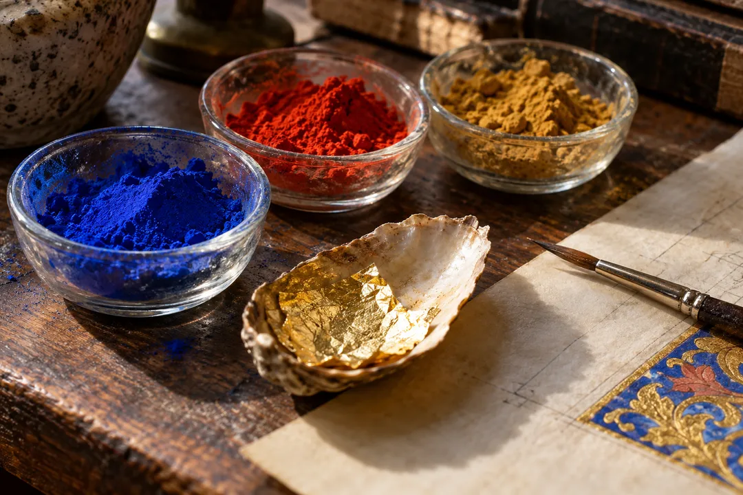
Start With the Sheet, Not the Colour
Painters usually pick colour first. Scribes working on illuminated initials should do the opposite. A cream laid sheet warms every blue you put on it, while a bright white cotton paper makes vermilion look harsh. Shepherds keeps papers in flat drawers and plan chests, so you can lay several sheets side by side under the same light and see how they shift. Ask to see handmade and mould-made options together, because the deckle edge and the texture change how a border reads.
Bring a single colour swatch from home, ideally a brushed square of the blue or red you already use. Hold it against each candidate sheet and note which ones flatter it. This takes five minutes and saves you from a stack of beautiful paper that fights your palette. The shop's staff are bookbinders at heart, so questions about grain direction and folding are welcome and often lead to better advice than a label would.
Weight matters as much as tint. A light sheet around 90gsm suits practice pages and folded booklets, while a finished illuminated leaf wants something heavier that will not cockle when you lay wet gouache across a border. If you plan to bind the page later, mention it at the counter, because grain direction decides whether the finished book opens flat or springs shut.
Choosing Traditional Pigments for That Sheet
Once the paper is settled, plan your pigments in three groups: a blue, a red and an earth. Historically scribes leaned on ultramarine or azurite, vermilion or red lead, and ochres, and modern gouache equivalents follow the same pattern. Pick one of each that suits your chosen sheet, then add white for tinting. A small, coherent palette teaches far more than a box of twenty tubes.
Shepherds' strength is the paper and the tools around it rather than a wall of pigment jars, so many London scribes pair a visit here with a colour stop at a colourman in Bloomsbury. Plan it that way: buy the sheet first, carry an offcut with you, and choose paint against the real surface. An honest call: skip pre-mixed metallic inks for serious illumination. They sit on top of the paper and dull within months, while shell gold or leaf ages gracefully.
Quills, Pens and Inks for the Lettering
The shop's lettering department displays dip pens, drawing inks and traditional writing tools side by side, making it an invaluable destination where scribes can evaluate pen balance and nib flexibility before buying. Classic broad-edge steel nibs offer crisp, reliable line discipline for formal book scripts, while specialty holders accommodate custom hand angles. Beginning scribes often rely on steel nibs for dense text blocks, pairing them with natural ruling pens for borders and decorative title capitals.
For ink, match the job. Iron gall ink bites into the surface and darkens as it dries, which suits archival pages, though it is acidic and needs a stable paper. Carbon-based black sits on the surface and stays neutral. Ask the counter which inks behave on the papers you have chosen, then test a line on an offcut before committing to a full page.
Pens and holders deserve a moment too. A straight holder with a cork or wooden grip tires the hand less across a long page than a thin plastic one. If you write in a formal book hand for hours, try a few holders at the counter and pick the one that lets your fingers relax. The small difference shows up in steadier strokes by the second hour.
Japanese Papers and Decorated Sheets
The chiyogami and decorated paper drawers draw a steady crowd, and seasonal ranges of patterned Japanese sheets keep regulars coming back. For calligraphers, these sheets are best used as covers, mounts and endpapers rather than as writing surfaces, since the printed patterns compete with lettering. A plain kozo or gampi sheet, by contrast, takes sumi ink beautifully and suits brush calligraphy in Japanese or Chinese styles.
The People You Will See There
Weekday mornings are quiet, with bookbinding students from evening courses picking up board and thread, and conservators buying archival tissue. Saturdays bring hobbyists with wedding-album and journal projects. The house rule is about handling: lift sheets by the edges, return them flat to the same drawer and never slide one across another. Paper scuffs easily, and staff notice.
A Victoria and Pimlico Walk
Westminster Cathedral is a short walk north along Victoria Street, and its mosaics and carved marble lettering repay a slow look, especially the lettered inscriptions set into the side-chapel mosaics. Head south instead and you reach Pimlico's stucco terraces, where Tachbrook Street Market gives you somewhere to eat before heading home.
For a lettering pilgrimage, Tate Britain is about twenty minutes on foot through Pimlico along the river, and its collection includes illuminated works by William Blake that show colour and text designed together. On a wet day, the walk is short enough to take the Victoria line one stop to Pimlico instead.
Practical Notes
The Victoria district provides direct transit links across London, with broad pavements leading toward surrounding cultural and riverside landmarks. Bring a rigid portfolio folder or a hard tube for large paper sheets, ensuring delicate mould-made or handmade deckles remain flat and uncreased on your journey home. Having a concise pencil checklist of your exact project dimensions ensures you buy the right sheet sizes without accidental waste.
Leave gilding for a later trip unless you already have gesso experience, and get the paper and pigment pairing right first. A well-chosen sheet makes modest paint look rich. If you want the cathedral, Tate Britain or a Pimlico café fitted around the visit, Karpo APP can sketch the afternoon route for you.
Ask Karpo for more information.
Keep reading
- Brixton Vintage Thrift Shop Finder: South London Retro Gems
 Notting Hill Vintage Thrift Shop Finder: Preloved Rails
 Soho Vintage Thrift Shop Finder: West End Designer Archives