 Brixton Vintage Thrift Shop Finder: South London Retro Gems
Hidden Gems & Odd Finds

Shoreditch Traditional Calligraphy Supply: An Ink Card Plan
Cowling & Wilcox in Shoreditch, an art supplier since 1961, makes a handy ink stop. Build a swatch card of blacks and browns before buying calligraphy inks.
Cowling & Wilcox provides a dependable art and graphics retail resource on Shoreditch High Street, catering to East London's creative community with drawing supplies, fine papers, brushes and studio inks. For practicing calligraphers and lettering artists working across East London, this branch is an accessible traditional calligraphy supply stop for testing ink viscosities, building palette depth and selecting sturdy pads. The most effective strategy is to construct a clear ink reference card before choosing your bottles.
Why Ink Choice Matters More Than It Looks
Calligraphers often treat ink as an afterthought and blame the nib when hairlines blur. The ink is usually the culprit. A thin, fast-drying ink suits pointed-pen Copperplate. A thicker, slow ink holds a sharp corner in Blackletter or Uncial. Pigment inks sit on the surface and resist water, while dye inks sink in and can feather on soft paper. Knowing which you need narrows the shelf from dozens of bottles to three or four.
Cowling & Wilcox is a general fine art supplier rather than a calligraphy specialist, so its ink choice is built around drawing and illustration. That is useful: Indian ink is a reliable, cheap black for drills, and acrylic inks give dense colour for display work. Skip the white acrylic ink for fine lettering, though. It clogs dip nibs within a line or two, and gouache thinned with gum arabic does the job better.
Paper changes the answer, too. The same bottle can look crisp on a hard-sized layout pad and fuzzy on a soft cartridge sheet, so judge every ink on the paper you practise with. Pick up a single pad of your usual practice paper at the store if you have run out, since testing on the shop's scrap gives a misleading result.
Build a Swatch Card in Ten Minutes
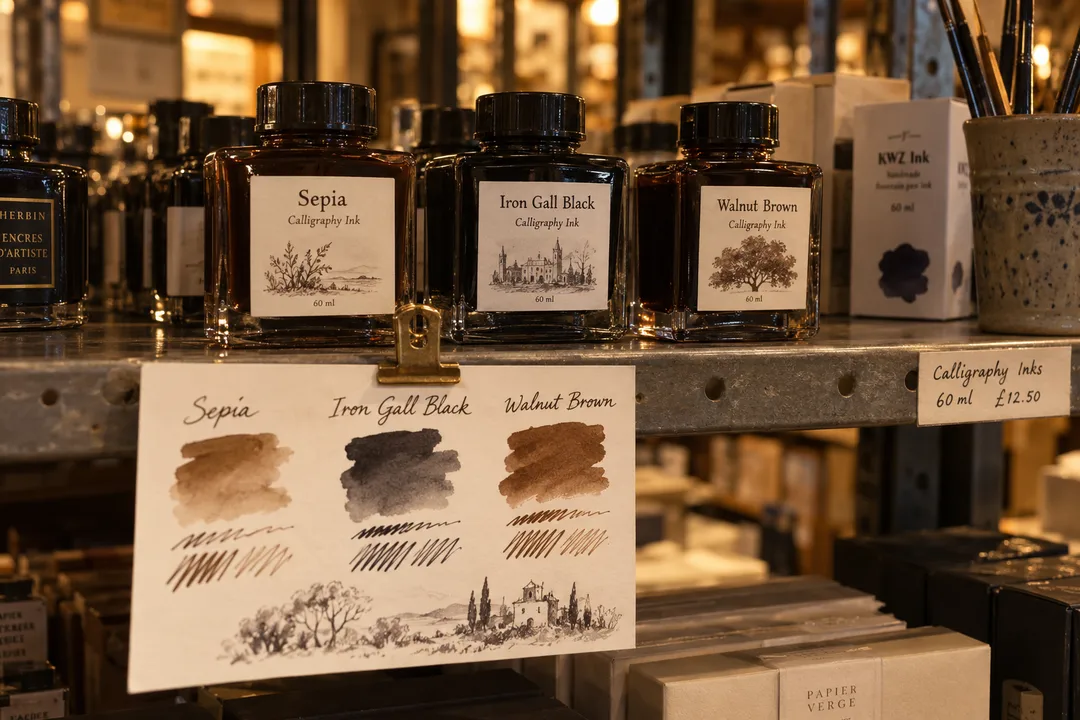
Cut a strip of your usual practice paper into a card about the size of a postcard and rule four columns. At home, fill the first column with your current ink: a thick stroke, a thin stroke and a quick wash. In the shop, ask to try candidate colours or note the brands you want to compare, then fill the rest of the card later the same day. The card makes your choice obvious within a week of practice.
Group the columns by job. One column for drill blacks, one for warm browns such as sepia or walnut for a historical look, one for a strong red for rubrics and versals, and one spare. Writing the brand and colour name under each column turns the card into a reference you will reuse every time you restock, which is how experienced scribes avoid buying the same disappointing bottle twice.
Brown, Black and Red: A Traditional Palette
Medieval scribes worked mostly in black and red, with brown appearing as iron gall ink aged. Modern equivalents give you a convincing historical look without the acidity. Pair a dense black for body text with a warm red for initial letters and headings, and keep a sepia for practice sheets where you want softer contrast. Three bottles cover almost every traditional exercise in a beginner's exemplar.
If you want genuine iron gall ink or stick ink to grind on a stone, plan a separate trip to a specialist colourman in Bloomsbury, since general art stores rarely carry them. Use Cowling & Wilcox for the everyday layer: drill inks, practice pads, a few soft brushes for filling in versals and a mixing palette. That split keeps your specialist spending for materials you cannot find in a general store.
Look at how the ink flows from the nib as well as how it looks when dry. A red that blobs on the first stroke and runs thin on the third will never give even versals. Thinning a too-thick ink with a few drops of distilled water, or thickening a thin one with gum arabic, fixes most problems, and these small adjustments are part of traditional practice.
The Shoreditch Crowd at the Counter
The Shoreditch shop regularly welcomes studio designers, printmakers and students from nearby East London art schools stocking up on studio essentials. Lettering practitioners will find attentive staff knowledgeable about ink flow, opacity and drying behavior across different paper surfaces. The aisles can become lively during peak hours, so keeping your workspace organized while comparing bottle labels helps maintain an easy flow for everyone.
The retailer maintains multiple London branches that share core fine-art inventory, providing convenient options across the city. For artists working in East London, however, the Shoreditch High Street shop remains particularly convenient, positioned within easy walking distance of local print studios, creative hubs and historic neighborhood lanes.
Redchurch Street, Brick Lane and Columbia Road
Redchurch Street runs off Shoreditch High Street a short walk from the store, and its independent shops and galleries make an easy loop. Brick Lane, a few minutes east, is lined with hand-painted shop signs and murals, a living sample book of letterforms. Photograph signwriting you admire and copy the letters at home with your new red ink.
On a Sunday morning, Columbia Road Flower Market is about fifteen minutes' walk north, and its shopfronts carry some of the most careful painted lettering in London. If you would rather sit and practise, Spitalfields Market to the south has covered seating and enough light to try out a new bottle on scrap paper. Avoid Brick Lane on Sunday afternoons if you want a calm walk, as the crowds peak then.
Practical Notes
Shoreditch High Street offers easy transit connections via overground and bus routes, linking smoothly into nearby rail hubs. Carry your dedicated swatch card, an HB pencil and a sealed pouch to transport ink bottles safely. Choosing large paper pads or heavy stock at the end of your visit ensures sheets stay flat and protected as you navigate neighborhood streets.
Give your swatch card a full week of daily drills before restocking, and add notes on how each ink behaved with your nib. That record is worth more than any shop recommendation. Ask Karpo APP to fold the store into a Shoreditch afternoon with a gallery on Redchurch Street or a Sunday flower market stop.
Ask Karpo for more information.
Keep reading
- Brixton Vintage Thrift Shop Finder: South London Retro Gems
 Notting Hill Vintage Thrift Shop Finder: Preloved Rails
 Soho Vintage Thrift Shop Finder: West End Designer Archives