 Shoreditch Comic Shop Crawl Planner: Murals to Manga
Hidden Gems & Odd Finds
Hackney Soft Pastel Paper Texture Picker: 3 Tests
Hackney pastel paper decisions start with a landscape you can revise. Compare lifting, layered color and dark grounds before choosing your drawing surface.
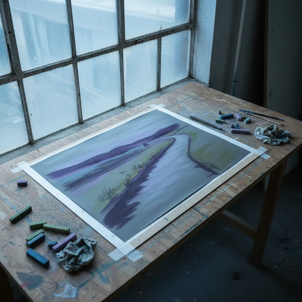
A landscape that changes while you draw needs paper that can tolerate your particular kind of revision. In Hackney, use a soft pastel paper texture picker to compare three actions: lifting a dark passage, adding a lighter layer and sharpening an edge afterwards. The project might be a canal bank reduced to violet water, grey buildings and a strip of mossy green. Its success depends less on the blank sheet's dramatic grain than on what remains possible after the first uncertain marks.
Start with the part you usually change
Think about the last landscape you abandoned. Perhaps the dark bank spread too far into the reflection, or a pale sky became a heavily rubbed patch. Write down that moment before browsing. A material comparison becomes useful when it recreates a real difficulty. If you habitually move the horizon, test that. If you never erase but keep adding color, judge the surface by layering instead. There is little value in paying attention to a feature your own practice rarely uses.
Hackney gives this project a vocabulary of contrasts: water beside hard edges, open stretches beside dense streets, foliage interrupting built forms. Choose a piece of the neighborhood that interests you and observe it from a place you select. You can gather shapes in pencil and return to pastel later. Such an outing works especially well for someone who likes the thought of drawing outdoors but prefers to handle dusty pigments at a settled workspace with their own familiar tools.
Test lifting without chasing a blank page
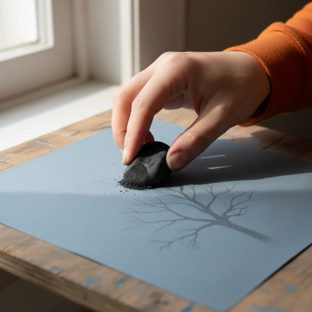
On a permitted sample, lay down a small dark area using the pressure you normally apply. Lift part of it with your usual method, then look for the difference between reduced darkness and a fully restored ground. Paper may retain a ghost of the mark even when much of the loose pigment has gone. That ghost is not necessarily a failure. It can become the quiet undertone of a tree or the first suggestion of a reflection.
The important question is what the next mark does. Place a middle tone across the lifted patch and across an untouched section beside it. Compare their edges and apparent brightness. If one side drags or looks duller, you have learned something about this particular combination of surface, pigment and revision. Do not keep scrubbing a borrowed sample to prove a point. A small, controlled comparison tells you more than damage created by a process you would never use in a drawing.
Let a darker ground do some work
A grey ground can hold together a landscape built from subdued colors. Leave some exposed between the green bank and violet reflection and see whether it feels like atmosphere or simply an unfinished gap. Try the same relationship on a warmer neutral if you have a suitable comparison. The ground should make your chosen palette easier to organize. It does not need to disappear, and it need not be the most eye-catching color in the finished picture.
For this project, skip the darkest surface if it forces you to cover every part of the sky with heavy pale pigment. You are aiming to preserve room for changes. A middle value may offer a less demanding starting point, particularly if your pastel selection contains only a few light colors. Conversely, a painter who enjoys dense opaque passages might welcome that resistance. The useful judgment is how much work the ground asks of your palette, rather than whether dark paper looks impressive.
Stack color before smoothing it
Build a compact patch from a cool violet, a muted green and a pale grey. Apply them lightly in succession, leaving an edge of each visible. You are observing whether later strokes sit distinctly above earlier ones or simply mix into them. A rougher texture may interrupt the marks in an appealing way. A finer one may give a quieter transition. Different pastel softness will change the result, so keep the sticks consistent while comparing the sheets.
Resist blending immediately. First see what the separate marks can do for a reflected bank or a broken strip of water. Then soften only half the patch with the tool you expect to use at home. Compare the blended and untouched halves at arm's length. A surface that looks slightly uneven close up may read beautifully as water from farther away. The best evidence is the visual effect you want, rather than the satisfying sensation of making pigment perfectly smooth.
Rescue an edge after the soft passage
Once the patch contains several colors, add a narrow dark line beside a pale area. Imagine it as the edge of a warehouse against a cloudy sky. Does it remain clear enough, or does it pick up so much surrounding pigment that it loses its role? Try a firmer stick if that is part of your normal kit. Your landscape needs a few decisive edges, even if most of it stays loose and atmospheric.
Make a separate note about support. A flexible sheet on an uneven board can make a stroke look broken for reasons unrelated to its tooth. Test on the kind of backing you expect to use and avoid comparing a firmly mounted sample with a loose sheet held in the air. This small practical detail can save you from dismissing a material that would suit your working setup. It also helps explain why a pleasing sample sometimes behaves differently once it reaches the desk.
Keep the Hackney outing open ended
For nearby place recommendations, ask in the Karpo APP for art material places around Hackney. You make the selections, choose the sequence and handle travel yourself. Keep your question about paper in your own notes so it remains separate from the recommendation. Nothing about a nearby suggestion promises a certain texture, a test sheet or a particular supply on the shelf. Your visit can still be worthwhile if it clarifies what you want to investigate next.
Pack a folder, a small pencil sketch and the limited palette you intend to compare, with the pastels enclosed. Ask before sampling and keep loose dust contained. After browsing, you might take a canal-side walk of your own choosing, looking specifically for places where a soft reflection meets a hard building edge. Back at home, arrange the tests in the order you made them. Choose the sheet that leaves you willing to revise the picture, because hesitation about wasting a beautiful surface can be as limiting as unsuitable tooth.
Ask Karpo for more information.
Keep reading
- Shoreditch Comic Shop Crawl Planner: Murals to Manga
 Bermondsey Comic Shop Crawl Planner: Zines Under the Arches
 Clapham Comic Shop Crawl Planner: Charity Shelves and Common