 Shoreditch Comic Shop Crawl Planner: Murals to Manga
Hidden Gems & Odd Finds

Greenwich Soft Pastel Paper Texture Picker: 3 Layers
Greenwich pastel paper choices begin with sky and water. Compare pale grounds, cloud layers and crisp horizons for a drawing with space left to breathe.
Pale paper can become the light in a sky study before the first cloud is drawn. This Greenwich soft pastel paper texture picker compares three layers: exposed ground, a soft cloud passage and a narrow horizon over color. The drawing is deliberately spare, with a wide sky above a small strip of water. It asks a particular question of the surface: can it support a few luminous changes while leaving enough quiet space for the weather to feel expansive?
Borrow the scale of the river
Greenwich's riverside setting offers a useful way to think about proportion. A sky can occupy most of the picture while the land and water remain narrow bands. During a walk you choose for yourself, notice how much information is needed to recognize a distant edge. A small shift in value may say more than a collection of tiny buildings. Gather an impression with a pencil or written color notes, then decide later which observations deserve a place in pastel.
This project is for the drawer who tends to overwork a sky in pursuit of smoothness. The goal is to preserve a clear difference between the paper's light and the pigment's light. Choose a modest palette of pale blue, cream, grey and a muted warm accent before comparing materials. A larger set can make it too easy to solve every problem with another color. A limited set exposes whether the surface itself helps you keep the air and water distinct.
Layer one: let the ground remain visible
Compare a pale blue sheet with a neutral light grey or ivory alternative, if you encounter suitable samples. Lay the same cream mark on each and leave a broad margin untouched. Does the paper suggest open air, or does it push the whole image toward a color you do not want? A blue ground can simplify the sky while making the water harder to separate. A warmer ground may give the cloud a different kind of brightness.
Look at the samples without the pastel sticks beside them as well as with the palette in view. The surrounding colors can distract you from the ground's contribution. You are choosing a starting relationship, not a finished sky color in isolation. If the picture needs large untouched areas, the blank paper must feel intentional there. If you prefer complete coverage, a beautiful pale ground matters less than the way the surface accepts your layers and handles your chosen blending method.
Layer two: build a cloud without filling everything
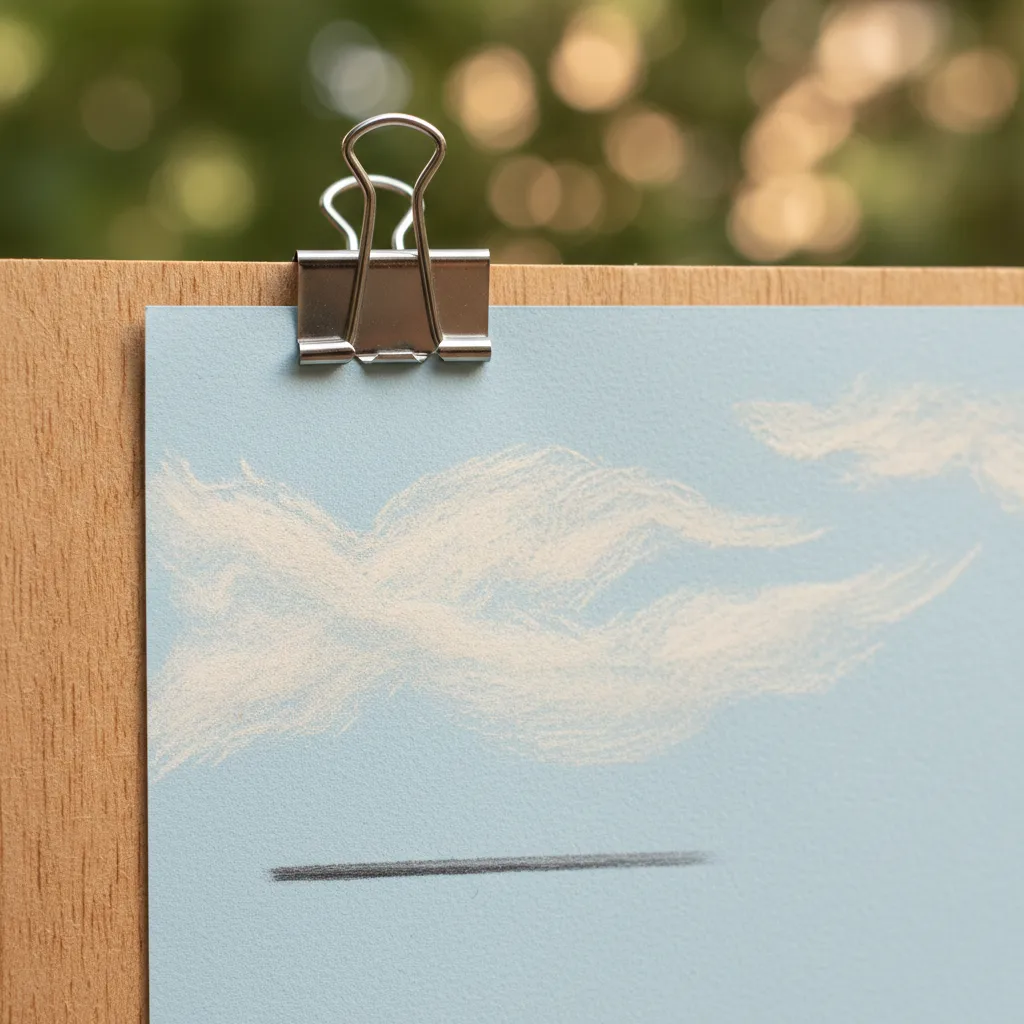
On an approved scrap, use the side of a pale pastel to suggest a cloud with one broad movement and a smaller turning edge. Let the surface break the mark. Those gaps may create a sense of light without further work. Then soften just one edge and leave another alone. A cloud needs differences within its boundary; treating every part with the same pressure and blending can make it read like a solid object cut from paper.
Try a faint grey underneath a second cloud and draw the pale passage over it. The purpose is to see whether the upper light remains legible, not to establish a universal limit on layers. Your sticks, pressure and color choices all affect the result. A very soft pastel may behave differently from a firmer one on the same sheet. Compare using the actual pair you expect to work with, especially if subtle cloud color is the reason for the project.
Read the grain from farther away
A visible paper pattern can be attractive close up and distracting across a broad unbroken sky. Hold the sample at the distance from which you would enjoy the finished drawing. If the repeating texture dominates the cloud, try a quieter surface. If the tiny interruptions merge into a lively light, the more pronounced tooth may be useful. The right choice depends on the scale of the marks and the size of the picture, rather than a simple preference for rough or smooth.
Skip a highly ridged paper for this sky if you find yourself drawing along its pattern instead of following the cloud. That response can quietly take over the whole composition. You may be better served by a less directional texture that lets the mark turn freely. Keep a separate scrap of the stronger surface if it interests you for another subject. An unsuccessful choice for clouds can still become an appealing ground for reeds, rooftops or a study of water broken by wind.
Layer three: make the horizon earn its sharpness
Draw a thin dark line across a lightly worked section, leaving part of the line incomplete. Imagine a distant bank visible through pale air. Compare that edge with a heavier version below it. The lighter touch may describe distance more convincingly, while the darker one could belong to a closer form. Your paper should allow you to distinguish the two deliberately. If both become the same fuzzy band, change the stick or the underlying layer before blaming the surface alone.
Now add a short horizontal stroke in the water and compare its direction with the cloud marks above. This is where a spare drawing starts to become a place. A smooth sky and an equally smooth water band can merge; one small change in mark can separate them. Test a broken stroke as well as a continuous one. You are looking for a surface that supports these differences while keeping the palette quiet, rather than demanding a new color for every piece of the scene.
Leave room for your own Greenwich day
Ask the Karpo APP for nearby art material place recommendations in Greenwich if you want a starting point for local browsing. You select any places of interest and make your own decisions about the order and travel. The material exercises belong to your drawing practice, rather than an app tool. Keep a written description of the paper qualities you want and judge any encountered materials on their own terms. A suggested nearby place carries no promise about paper stock or permission to sample.
Pack a clean protective folder and keep pastels enclosed during a separate riverside stroll. If rain makes a walk unappealing, you can develop the sky study at home from your own earlier sketches or remembered color relationships. Let the day remain flexible. When choosing between samples, favor the one that makes a restrained drawing feel complete with fewer corrections. The picture should leave you looking into the pale space above the horizon, with the paper quietly carrying some of the light you chose to preserve.
Ask Karpo for more information.
Keep reading
- Shoreditch Comic Shop Crawl Planner: Murals to Manga
 Bermondsey Comic Shop Crawl Planner: Zines Under the Arches
 Clapham Comic Shop Crawl Planner: Charity Shelves and Common