 Shoreditch Comic Shop Crawl Planner: Murals to Manga
Hidden Gems & Odd Finds

Brixton Soft Pastel Paper Texture Picker: 3 Grounds
Brixton pastel paper choices start with bright color on dark grounds. Compare violet, brown and black surfaces for a still life with luminous highlights.
Dark paper earns its place when the spaces between bright marks feel as deliberate as the marks themselves. For a Brixton still life of a yellow pear against red cloth, this soft pastel paper texture picker compares violet, brown and black grounds. Each begins the picture with a different kind of shadow. The task is to find a texture that lets a bright stroke hold its character without requiring you to bury the entire sheet beneath opaque color.
Build the palette around one ordinary object
A pear and a folded cloth give you enough contrasts for a demanding paper comparison: curved against angular, warm light against cool shadow, soft fruit against a sharp fabric crease. Use objects you already have rather than turning the exercise into another shopping list. Place them in a single light and make a quick thumbnail. The image needs a clear relationship between the object and its surroundings before a dramatic ground can contribute anything useful.
Brixton's lively street setting can supply a mood of strong contrasts without becoming a literal subject. On an independently chosen walk, you might notice warm color beside deep shade, a bright garment against a dark doorway or the way a small patch of light gathers attention. Record your own observations rather than borrowing an imagined local scene. At the drawing table, those impressions can become decisions about where the paper stays exposed and where the pastel becomes thick and luminous.
Violet changes the color of the silence
Set a small lemon-yellow mark on a violet sample and leave plenty of the ground visible. Look at the boundary before you blend anything. Does the surrounding color make the yellow feel more vivid, or does it pull the picture away from the quieter still life you intended? Violet can be an active participant in the image. Its usefulness depends on whether you welcome that participation in the areas between the pear, the cloth and their shadows.
Add a muted red beside the yellow and compare the pair. An appealing single swatch may reveal a less comfortable relationship when a second color arrives. You are choosing a ground for a whole arrangement, not a display for your favorite pastel. Try a cooler or duller version of the red if it belongs in your existing palette. If every adjustment feels like an attempt to escape the violet, choose a less assertive paper rather than forcing the drawing to justify it.
Brown can connect the fruit and the cloth
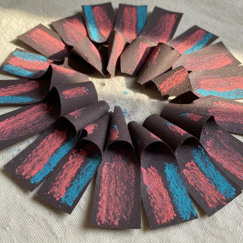
A brown ground offers another question: can the paper act as the shared middle value beneath warm fruit and fabric? Leave an irregular opening in the red cloth patch and see whether it reads as a fold or as a hole. Then place a cool shadow next to the yellow. The ground may help link those passages, but its role should remain visible in the test. Covering it completely defeats the purpose of comparing its contribution to this particular composition.
Pay attention to the exact brown in front of you. A reddish tone and a cooler earthy tone can produce different relationships even when their textures look similar. Keep your sample marks modest and compare under the same light. If the fruit looks flat, you may need a clearer separation of light and shadow rather than a different sheet. A useful paper choice makes those separations easier to place; it does not solve the arrangement or the drawing on your behalf.
Black asks the highlight to do more
On black paper, try a pale yellow highlight using a light hand. Notice whether the first stroke feels luminous enough or whether you immediately reach for repeated layers. The amount of coverage you enjoy is part of the decision. Someone who likes building substantial passages may welcome the dark start. Someone hoping for a few quick marks might prefer a less demanding value. Judge the result from the intended viewing distance before deciding that the surface requires more pigment.
Skip the black ground for this project if you can only separate the pear from its background by outlining the whole fruit in bright color. That may be an interesting graphic effect, but it changes the intended still life. A violet or brown ground might let you lose one edge into shadow and keep another in light. The point is to choose where the object appears and disappears, rather than let the paper impose the same solution around every part of it.
Put texture through a highlight test
Where sample drawing is permitted, make a broad red field, a yellow curve and a small pale accent. The curve tests whether the tooth supports a turning form; the accent tests a distinct light over an existing passage. Leave a dark gap between them. A coarse surface may make the highlights sparkle in separate fragments, while a quieter texture can carry a more continuous shape. Neither is inherently more realistic. Choose the relationship that suits the scale and energy of your planned image.
Compare an untouched curve with one softened at the shadow edge. If blending makes both edges equally vague, you have learned to reserve that action for a smaller area. The test should help you use the paper, rather than merely rank it. Include your usual applicator if one belongs in your practice, and keep the first pigment layers light enough to leave room for a change. Repeating the same simple arrangement on each sample makes the differences easier to read.
Keep the local browse separate from the studio decision
For nearby art material place recommendations around Brixton, use the Karpo APP as a starting point. You decide which suggested places appeal, choose a visiting order and organize your own travel. The comparison of violet, brown and black is an exercise you carry with you. A nearby recommendation does not certify a paper's availability or a place's sampling arrangements. Keep your options open and ask before using any display sheet for a pigment test, however small the mark might be.
Carry a firm folder so dark surfaces do not rub against loose tools, and keep the pastels wrapped during any neighborhood wandering. Back at home, compare the samples beside the actual pear and cloth under your drawing light. Choose one sheet and begin with the largest shadow shape left as bare paper. Add the red passage, turn the yellow form and reserve the brightest accent until it has somewhere to matter. A good decision will be visible in the quiet dark areas as much as in the color you place above them.
Ask Karpo for more information.
Keep reading
- Shoreditch Comic Shop Crawl Planner: Murals to Manga
 Bermondsey Comic Shop Crawl Planner: Zines Under the Arches
 Clapham Comic Shop Crawl Planner: Charity Shelves and Common