 Shoreditch Comic Shop Crawl Planner: Murals to Manga
Hidden Gems & Odd Finds
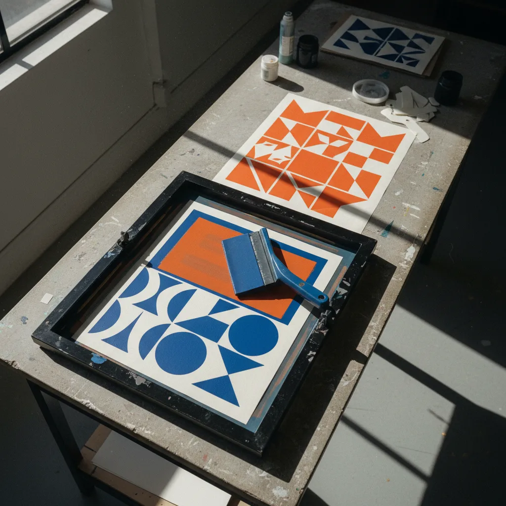
Peckham Screen Printing Squeegee Picker: 3 Poster Decisions
Build a two-colour poster test around edge condition and repeatable pulls, then browse Peckham according to your own priorities.
Two-colour posters reward repeatable pulls more than heroic pressure. A blade that you can control consistently is a better starting point than the hardest option you can find. This Peckham screen printing squeegee picker links three decisions to a paper poster: the edge you will use, the flex you will compare and the way you will keep a trial readable. Begin with two simple shapes that overlap on purpose. Their meeting point will tell you more about the setup than a complicated illustration full of accidental ambiguities.
Design a test you can actually read
Choose a circle and a rectangle, or two other broad forms with a clear crossing. Include a small unprinted gap somewhere in the composition. The large field shows coverage; the gap gives detail a place to fail visibly. Use paper appropriate to the ink and printing process you intend to try. Keep the design modest enough to fit your frame comfortably. An enormous poster is an exciting objective, but it makes an unnecessarily complicated first test of a blade you have never used.
Peckham's shifts between busy streets, brick surfaces and open sky can feed that graphic exercise. Look for a strong shape rather than trying to reproduce an entire streetscape. A dark opening against a light wall might become one layer; a shadow cutting across it might become the other. These are observations you can choose to make during your own outing. They are not evidence of a particular print studio, a local class or a supply shop with the exact equipment the project requires.
Decision one: choose a reference edge
Start the comparison with a square profile if a defined working corner suits the intended paper print. Inspect the continuous edge rather than judging the blade by its broad face. A nick can introduce a repeating unwanted mark, while wear can alter the contact you thought you were comparing. Rounded and bevelled shapes are different tools for particular purposes, not automatic upgrades or downgrades. Ask what a changed contact shape would contribute to the specific deposit you want before adding another profile to the shortlist.
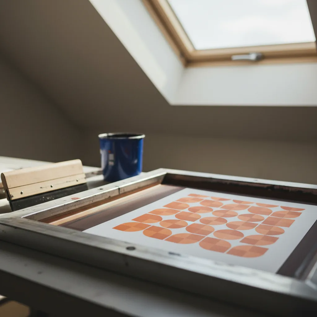
A clean edge still depends on the surrounding process. Mesh, stencil quality and ink behaviour influence how clearly the shapes print. Do not demand that one blade solve every broken contour or uneven field. The useful early choice is a reference you understand well enough to test, with its profile and construction written down. If a sample is available for handling, obtain permission and avoid touching or scraping the working corner. The part that looks least dramatic in a display is the part you are relying on.
Decision two: compare flex without changing everything
Durometer gives you a hardness specification, but the assembled tool also responds to blade thickness, projection from the holder and overall construction. Compare those details together. A relatively firm blade may resist bending more under comparable conditions; a softer one may flex more readily. Neither description tells you exactly how your poster will look. If one candidate has a much longer exposed blade than another, the difference you feel should not be attributed to the hardness number alone. Keep the comparison honest.
Skip a harder option chosen solely to compensate for uncertainty about pressure. Excessive effort can become its own source of inconsistency, especially across a run of prints. Think instead about a controllable movement you can repeat from the beginning of the image to the end. During a permitted dry hold, notice whether the handle makes you tense your fingers or rotate your wrist awkwardly. Save judgments about actual ink transfer for a suitable print trial. A comfortable display hold and a successful pull are related but different observations.
The first layer should establish a baseline
Before introducing the second colour, make the first shape consistently readable. Keep the same paper and record the blade configuration. Note a recurring streak, an incomplete corner or a lost gap in ordinary words beside the sample. Do not immediately change blade, ink preparation and pressure together. Several simultaneous adjustments may improve the print while leaving you unable to explain why. The baseline does not need to be beautiful; it needs to make the next comparison meaningful enough to guide a later choice.
Let the ink reach the appropriate condition for the next stage according to its handling guidance. A second layer placed on unsuitable first-layer conditions creates problems that can be mistaken for blade failure. Decide in advance what a successful overlap should look like. If the colours are intended to create a visible combined area, inspect that area separately from the clean outer edges. Keep registration arrangements stable during the comparison. The squeegee does not independently align your layers, and a different blade cannot replace that part of the setup.
Decision three: size the blade around the poster
The image needs full coverage within the usable frame opening, with enough clearance for the movement you intend. Measure the print width and the actual internal space rather than trusting the frame's exterior size. Consider the start and finish of the stroke too. A long blade can feel manageable at rest and awkward at full reach. Choose a length justified by this poster, then evaluate another format as a separate project instead of buying around every possible future idea at once.
Carry only what will help the browsing conversation: an image thumbnail, a paper sample and your frame measurements. A neat project envelope is easier to handle than a large screen when the afternoon also includes an independent walk. If you want nearby recommendations in Peckham, ask Karpo APP for art-material places. You remain responsible for choosing where to go, in what order and how to travel. Keep the print specifications in your own notes and assess possible places according to your interests and the questions still unresolved.
Make room for a different outcome
A materials outing can reveal that the poster design needs simplifying, or that your current blade deserves another trial before replacement. Both are useful decisions. If the project questions are answered early, spend the remaining time looking at colour relationships around the neighbourhood rather than seeking more equipment to compare. If rain makes browsing cumbersome, shorten the afternoon and continue the drawing at home. The aim is a better print decision, with the amount of walking and shopping chosen by you.
After the two-layer experiment, keep one sample that represents the result you would want to repeat. Attach a brief description of the edge, holder and relevant print conditions. Clean the equipment in a way suitable for its materials and ink, and store the blade so its corner is protected. Review the overlap, the small gap and the broad colour field before deciding on another tool. A focused Peckham poster project ends with a process you can explain, even if the clearest conclusion is to keep the squeegee you already own.
Ask Karpo for more information.
Keep reading
- Shoreditch Comic Shop Crawl Planner: Murals to Manga
 Bermondsey Comic Shop Crawl Planner: Zines Under the Arches
 Clapham Comic Shop Crawl Planner: Charity Shelves and Common