 Shoreditch Comic Shop Crawl Planner: Murals to Manga
Hidden Gems & Odd Finds

Soho Rubber Stamp Ink Pad Picker for Dark Invitations
Choose a rubber stamp ink pad for dark invitations in Soho by comparing pale opacity, fine detail and handling, then explore nearby places independently.
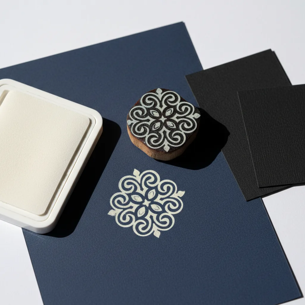
Dark invitation card changes what counts as a successful stamped mark. A Soho rubber stamp ink pad picker needs to consider opacity before falling for the colour on a closed lid. For a small gathering, imagine a pale ornamental shape on navy or burgundy stock, leaving the words to your own pen or another printing method. The right comparison asks whether that ornament remains readable after drying and survives ordinary handling without blurring its finer gaps.
The pale mark has to earn its contrast
White paper supplies brightness beneath a transparent ink; dark card does not. A delicate pale shade that looks vivid on a white test sheet may become barely visible on navy. Start the project with the actual dark stock in front of you. If the desired look is a softly translucent ghost, that faintness can be intentional. If guests need to see a clear decorative emblem, compare an ink specifically described for the required coverage and substrate.
Choose an abstract ornament without readable lettering for the first trials. Curved lines and small interior spaces show whether a pale ink keeps its definition. Avoid asking the stamp to carry essential event information while you are still learning the materials. That separation leaves room to change the decorative element without remaking the whole invitation. It also makes a simple motif feel considered: a small accent can do more than a densely printed border around every edge.
Navy and burgundy are different backgrounds
Set the two cards beside each other before inking the rubber. Navy can sharpen the perceived coolness of a pale mark; burgundy can make the same colour feel warmer or softer. The paper's finish may matter as much as its hue. A smooth uncoated surface and a glossy coated card are different printing problems even when they share a colour name. Use the printed compatibility instructions to decide which trials are appropriate for a particular pad.
Inspect the paper under an ordinary room light as well as beside a window. An invitation will probably be handled in several settings, and a subtle mark can disappear when its only contrast comes from reflected light. You do not need a technically elaborate test: turn the dried sample and move it away from the brightest spot. Decide whether the ornament still reads in the places where someone is likely to open the envelope.
Metallic appearance is not a shortcut
Silver can be tempting for a Soho-inspired palette of dark card and evening light. Treat a metallic effect as its own choice, rather than assuming it will be brighter or more opaque than white. Reflective particles can change the way a mark looks as you tilt the sheet, and small details may behave differently from a solid patch. Compare the dried ornament itself, not just a broad colour swatch made with the corner of the pad.
Some decorative processes involve powder, heat or other equipment beyond stamping alone. Keep those processes separate from a straightforward ink-pad project. If your workspace or preferred materials do not suit an additional treatment, choose a formulation intended to work with the simpler method. Do not improvise heat settings or assume that every stamp material tolerates the same cleaning approach. The attractive finish has to fit how you actually want to make and handle the invitations.
Soho supplies a mood rather than a stock list
The small streets around Soho Square and the movement near the theatre district suggest an invitation with a little drama: dark ground, one bright gesture and plenty of restraint. You can carry that mood into an independent browsing afternoon without claiming that a particular shop sells specialist inks. A glowing window or a contrast of painted doors may inspire the palette even if it has nothing to do with stationery. Let visual references remain references.
The Karpo APP offers nearby place recommendations for a Soho outing. Ask for stationery, art or design-related places near the area you choose, then decide which suggestions suit your interests. You arrange the stops and travel yourself. A short paper brief can help keep the invitation in focus: navy stock, pale ornament, dry handling test. The app's role is discovering places; your material decisions come from the project and the evidence you gather from the actual supplies.
Protect the tiny spaces in the ornament
With a light opaque formulation, excess ink can fill narrow carved gaps. Load the raised surface evenly and inspect the rubber before making the trial. If the ornament looks like a white blob, increasing pressure will rarely restore its missing spaces. Try a lighter, steadier impression on an approved scrap. Change one part of the technique at a time, so you can tell whether the improvement came from less ink, better contact or a more suitable paper surface.
A stamp that is very intricate may simply be a poor match for the finish you want. Skip the smallest flourishes if they repeatedly disappear. A slightly bolder ornament can retain an elegant shape while being easier to reproduce across several cards. Assess the result at the scale of an invitation, rather than magnifying every imperfection. The recipient needs a clear visual accent, not evidence that you fought every narrow channel in the rubber into obedience.
The envelope is part of the handling test
Before making the full set, allow a trial to dry as directed and gently test it with a clean scrap. Then place the card in the envelope you intend to use and remove it. Look for transfer, scuffing or an impression on the envelope lining. A mark that appears dry on a flat table can still be vulnerable to friction. This small rehearsal is more informative than judging readiness solely by the absence of a wet shine.
If the pale mark remains fragile on your selected stock, consider moving the ornament onto an uncoated paper insert or a separate belly band. That changes the composition without forcing the ink to behave on an unsuitable surface. Another option is to use lighter card and a darker pad. Keep the gathering's tone in mind: the point is an invitation people enjoy opening, rather than preserving the original colour scheme at the expense of a workable result.
Practical decisions before the full set
Calculate your paper allowance around practice, not only the final number of invitations. Set aside scrap from the same stock so you can re-establish a consistent impression after a pause. Close the pad between sessions according to its instructions and keep different formulations away from one another unless their maker describes them as compatible. A clean, supported stamping surface and room to leave cards separated are more useful than accumulating several nearly identical shades of silver.
Finish the Soho browsing visit when you have a clear next experiment, whether or not you have chosen a pad. Back home, compare pale coverage, preserved detail and envelope handling in that order. Retain the strongest dry proof with a note of the paper and technique you used. That simple reference turns a dramatic colour idea into a repeatable invitation, while leaving the street's evening glow as inspiration rather than a promise printed onto the product.
Ask Karpo for more information.
Keep reading
- Shoreditch Comic Shop Crawl Planner: Murals to Manga
 Bermondsey Comic Shop Crawl Planner: Zines Under the Arches
 Clapham Comic Shop Crawl Planner: Charity Shelves and Common