 Shoreditch Comic Shop Crawl Planner: Murals to Manga
Hidden Gems & Odd Finds

Peckham Rubber Stamp Ink Pad Picker: Cotton Paper Choices
Pick a rubber stamp ink pad for cotton-paper cards in Peckham by comparing coverage and dry colour, with nearby browsing choices left entirely to you.
Cotton paper can make a broad rubber stamp look beautifully uneven. A Peckham rubber stamp ink pad picker should therefore start with the edge you want: crisp enough for an abstract shape to hold together, or broken enough to reveal the sheet's fibres. For a small personal art-card project, neither option needs to imitate a commercial print. Your task is to make the irregularity feel chosen, with a pad that suits both the stamp and the paper.
An art card with room for a rough edge
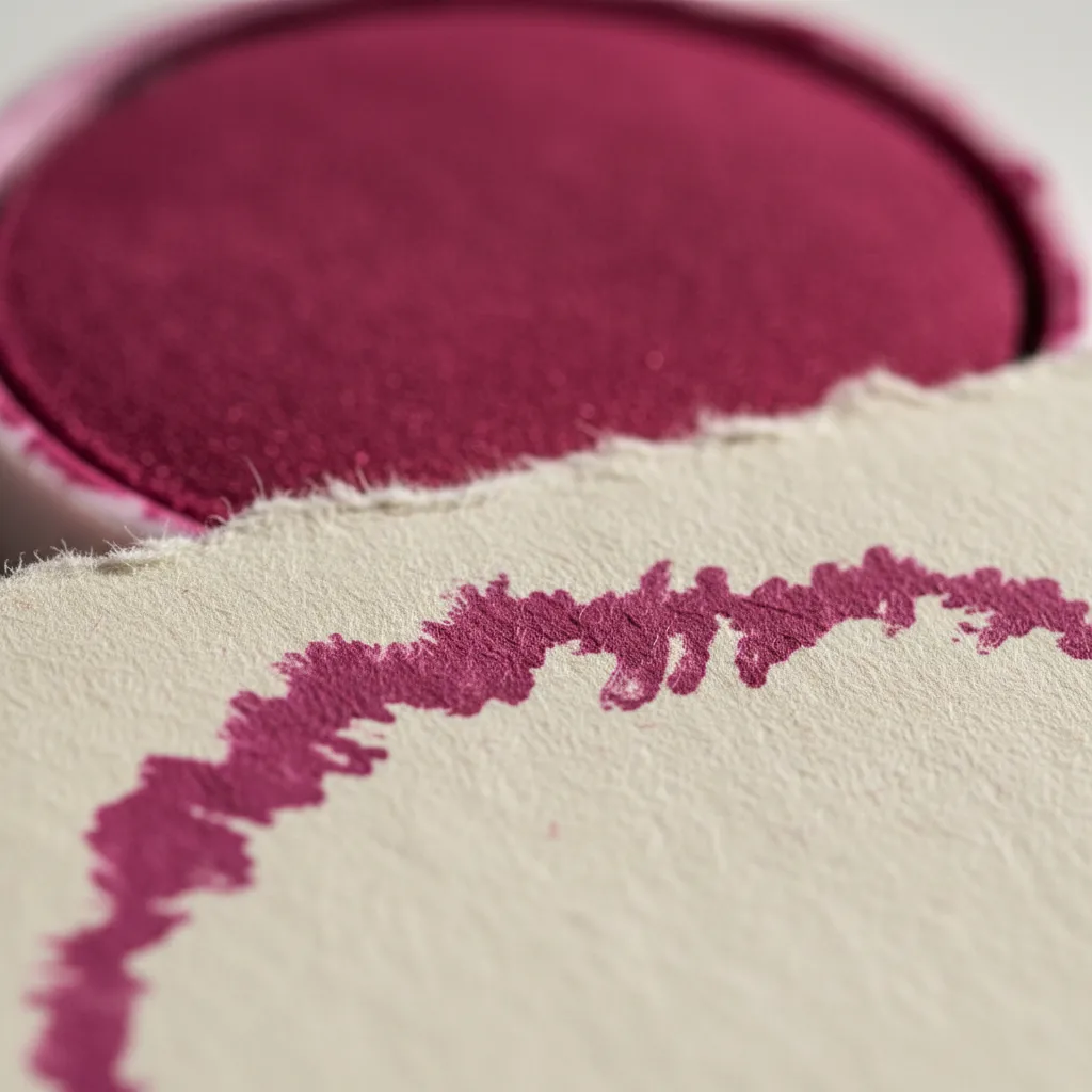
Begin with a sweeping curve, a loose block or an oversized petal cut into rubber. Avoid tiny lettering for this experiment; broad forms make changes in coverage easier to see. Place the shape off centre on a blank cotton card and imagine where the untouched paper will remain. That empty space gives the ragged perimeter a purpose. Without it, a richly coloured impression can become a heavy rectangle that hides the material you chose for its texture.
This proposed project works for a friend making a few art cards, an illustrator testing a new motif or someone who wants to move beyond purchased patterned stationery. Those are possible uses, rather than invented accounts of people encountered in Peckham. Keep the brief personal: one broad shape, one paper stock and a colour with enough presence to stand alone. The finished card can remain expressive without needing a story about a maker or retailer.
Cotton content does not describe the surface
A cotton sheet may be smooth, lightly textured or deeply irregular. Its surface treatment also affects how liquid enters the fibres. Do not assume that all cotton paper will absorb a dye pad in the same way, or that a thick card is automatically the easiest to stamp. Examine an actual offcut from your chosen batch. Run a clean fingertip over the unprinted surface and look across it in side light to understand its peaks and hollows.
Deckled edges can be part of the appeal, but keep them away from your first comparison area. Printing close to an uneven outer edge changes the support beneath the rubber and introduces another variable. Begin in the flatter centre of a scrap. Once the ink behaves as you want, explore a composition closer to the deckle. The experiment becomes easier to interpret when surface texture and the physical edge are considered separately.
Read the pink after it dries
A coral or magenta pad offers a clear way to examine colour on warm white cotton paper. Compare a light impression with one made after more even inking, using the same steady stamping movement. Look for whether the broad area remains lively or becomes patchy in a distracting way. The damp sheen can make a print seem more saturated than its finished state. Put the trial aside and make your colour decision from the dried sample.
Pigment-based inks can offer a more opaque appearance, while dye-based inks may let more of the paper's character show through. These are possibilities to test, not fixed outcomes for every formulation. Use the maker's stated compatibility guidance to narrow the choice. An ink intended for an unrelated surface does not become suitable simply because its colour is perfect. For an uncomplicated art card, favour a process that fits the tools and working space you already have.
A Peckham setting for looking closely
Peckham's mix of railway infrastructure, lively main streets and quieter residential pockets gives a materials outing plenty of visual contrast. The area around Rye Lane can supply a mood of movement and colour, while a slower stretch near Peckham Rye can make room for looking at forms and silhouettes. These are neighbourhood cues, not a claim that a named gallery, workshop or shop stocks the things in this project. Let the outing remain open to your own interests.
Use the Karpo APP to discover nearby places for an art and craft browsing visit in Peckham. You could ask for recommendations around the part of the neighbourhood you want to explore. The choice of stops, their order and the journey between them are yours. Pack a small cotton-paper offcut and a picture of your stamp in a protective folder; either can help you explain the project without carrying the whole workbench through the neighbourhood.
Pressure, support and the size of the pad
A broad stamp needs even support as well as adequate ink. Work on a stable surface and lower the rubber without sliding. If the print has a pale centre, inspect contact and loading before compensating with force. More pressure may squeeze colour into spaces that were supposed to remain open. A raised pad can make it easier to cover a stamp larger than its case, but its usable surface and the stamp's shape still deserve a practical comparison.
For a large solid shape, inspect the inked rubber before committing to the card. You are looking for an even film rather than obvious puddles. A corner that looks dry may transfer weakly; an overloaded section may obscure the texture. Develop a movement that you can repeat comfortably. A heavy stamp that strains your wrist or needs constant rescue may be a poor partner for a relaxed home session, however appealing its isolated trial print looks.
When a broken impression earns its place
Judge the dry card from two distances. Close up, look for individual fibres and the relationship between the colour and the sheet. From farther away, ask whether the abstract form still has a clear direction. A small break can enliven a curve; several large blank islands can make it feel accidental. Choose a reference proof that captures the amount of interruption you like, so later prints have a visual target without needing to become identical.
Skip a second colour until the first shape feels resolved. Adding a contrasting print can make a muddled first impression harder to diagnose. If the cotton texture swallows too much detail, switch to a bolder motif or a smoother cotton sheet before collecting more shades. If you love the broken surface, leave it alone and make the surrounding composition simpler. Restraint can be the most effective way to show that the irregularity belongs to the design.
Practical notes for transporting fragile proofs
Cotton-paper offcuts can collect creases and dirt while travelling in an open tote. Keep the clean samples between rigid sheets, and carry printed tests separately until they are fully dry. Do not stack an impression that still feels tacky or use an arbitrary drying time as proof of readiness. Follow the particular ink's instructions. When testing is offered during a browsing visit, ask before placing your own paper or rubber on a shared work surface.
A successful Peckham outing may end with no purchase and a sharper project brief: a broad magenta curve, warm cotton paper and a deliberately soft boundary. Back at your workspace, use that brief to assess any pad you consider. Close and store it as directed, clean the stamp with a compatible method and retain the chosen proof. The next card should begin from a decision you understand, with enough freedom left for the paper to remain visible.
Ask Karpo for more information.
Keep reading
- Shoreditch Comic Shop Crawl Planner: Murals to Manga
 Bermondsey Comic Shop Crawl Planner: Zines Under the Arches
 Clapham Comic Shop Crawl Planner: Charity Shelves and Common