 Shoreditch Comic Shop Crawl Planner: Murals to Manga
Hidden Gems & Odd Finds
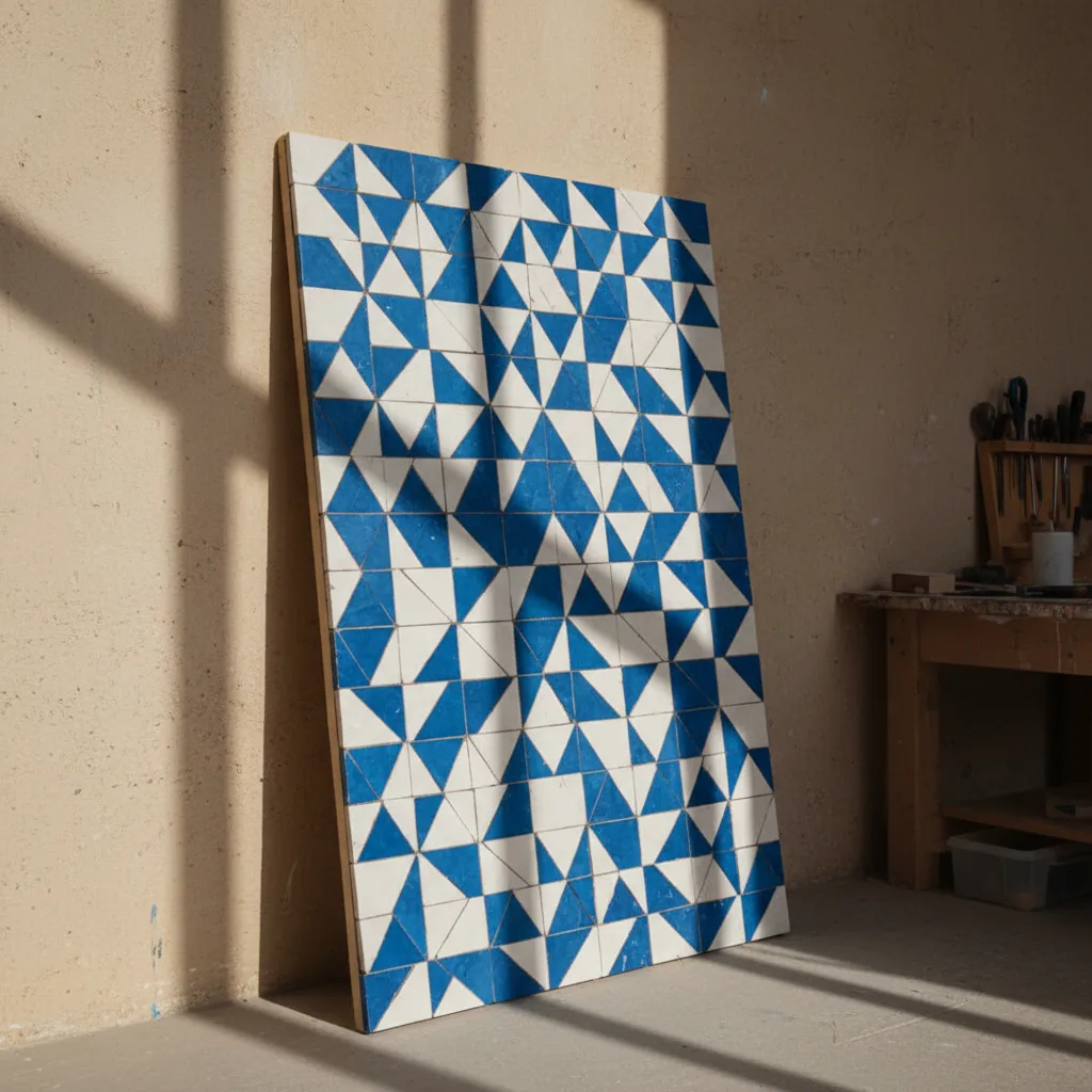
Peckham Mosaic Tile Craft Picker: 3 Shape Decisions
Cobalt triangles and clear silhouettes give a Peckham material outing a purpose: finding the few shapes that make a graphic panel work.
A graphic mosaic succeeds when its silhouette remains clear across the room. In Peckham, make shape the first decision and colour the second: a square grid, a field of triangles or a curved boundary will each demand different pieces. This mosaic tile craft picker exercise uses a cobalt-and-chalk panel as a working brief. It suits someone who enjoys the visual energy of Rye Lane and wants a bold object without filling every available gap with decoration.
Pick the outline before the pieces
Begin by cutting a panel shape from plain paper. A tall rectangle can give a repeated motif an upward pull, while a broad rectangle invites a horizon or a sideways rhythm. Try the silhouette in the place where the work might eventually hang. This is a scale decision rather than an installation test. A panel can feel surprisingly small beside a large shelf, even if it seemed ambitious when it occupied the whole kitchen table.
Choose a single graphic idea that survives as a black shape on white paper. A stepped diagonal, a broken circle or a stack of offset triangles are useful possibilities. If the idea needs five colours before you can recognise it, the underlying shape may be doing too little work. Reduce it to two values first. Strong contrast makes the next stage easier because you can judge spacing and repetition without arguing about subtly different shades of blue.
Decision one: grid or diagonal
Squares provide an obvious structure, but they need not produce a static checkerboard. Interrupt a row, change the width of a band or allow a broad plain area beside the repeated section. The grid becomes a reference against which small changes register. On your sketch, shade every other square and then remove some of the shading. Notice where the composition begins to move. That gives you a more precise material question than simply looking for geometric tiles.

Triangles introduce direction quickly. Their points can gather attention at a centre or push it towards an edge. Try repeating them with the same orientation, then reverse one group. A seemingly tiny change can alter the whole panel's rhythm. If you plan to use precut shapes, keep their proportions in mind while drawing. An equilateral triangle and a narrow wedge behave differently, and a design based on one does not automatically accommodate the other.
Decision two: curves made from straight edges
A circular boundary can soften an otherwise angular composition. In mosaic, the curve is often an arrangement of small straight edges rather than a single continuous line. Place paper squares along a drawn arc to see how size affects the result. Larger pieces make the curve visibly faceted; smaller ones can suggest a gentler turn. Neither is a defect. The choice should agree with the graphic language of the rest of the panel.
Do not make every boundary equally complicated. A panel with diagonal triangles, a wavy outside edge and a circular centre may contain three unrelated instructions. Pick the one that matters most and let the others become quiet. For a first shape-led project, a straight outside edge with one demanding internal curve offers enough variation. Skip a scalloped perimeter if it adds work without strengthening the central idea you liked on the paper silhouette.
Decision three: how big can the motif be
Draw the same motif at several sizes on scrap paper. A large triangle can feel decisive, while a cluster of tiny triangles may read as texture rather than individual shapes. Place the trials beside one another and step back. Consider whether the viewer should recognise the motif immediately or discover it on closer inspection. A graphic panel for a shared living room often benefits from a simpler long-distance reading, with finer detail saved for a smaller area.
Spacing changes perceived size too. A modest shape surrounded by open ground may command more attention than a larger shape pressed against its neighbours. Keep some deliberate pauses between repeated groups. At the dry-layout stage, move a whole cluster rather than adjusting every tile separately. This makes the compositional change easier to see and helps you avoid spending an afternoon polishing a tiny detail inside a structure that still feels cramped.
Let Peckham supply visual contrast
For an outing around Rye Lane, you might treat broad colour blocks and layered street detail as prompts for your own drawing. Notice how a plain rectangle can hold its ground beside a busier surface. Keep any observations general and make your own sketches; the exercise does not require naming businesses or assuming what is available inside them. The neighbourhood's role is to sharpen attention to contrast, proportion and the edges between different kinds of visual activity.
A self-chosen pause towards Bellenden Road or Peckham Rye can offer a different frame of mind. After concentrated detail, more space can reveal whether your design has become too crowded. Look again at the paper motif before collecting another visual idea. You can decide to keep the outing to one area, continue elsewhere or head home. The project does not improve merely because the day includes more stops, and your travel choices remain entirely yours.
Materials that serve the drawing
Once the shape decision is clear, compare ceramic pieces with compatible dimensions and thickness. The important question is whether they let the drawing keep its rhythm. A slightly less exciting blue may work better than a spectacular glaze if the latter arrives in shapes that fight the intended pattern. Ask about suitability for the actual backing and decorative use you have in mind. Treat adhesive and finishing choices as part of that same material discussion.
Glass can add a sharp accent, but place it with a reason. One bright diagonal may emphasise the geometry; scattered sparkle across every shape may blur the hierarchy. View the combination under different angles if sample handling is permitted. For a deliberately graphic piece, finish variation should reinforce the shape rather than become a separate subject. The restraint is useful: it gives the eye a clear sequence of large form, smaller rhythm and occasional highlight.
Nearby discovery, followed by your judgment
Karpo APP offers nearby place recommendations. Ask for craft-related places around Peckham, then choose the suggestions that make sense for your browsing day. Bring the outline and a note describing the shapes you are considering. You select where to go, how to travel and whether any suggested place fits the project. A nearby recommendation can introduce a possibility; it is your drawing and your material comparison that determine whether the visit is useful.
If a friend joins, give them a simple task: describe the main shape after looking at the sketch briefly. Their answer can reveal whether your intended focal point is actually visible. Avoid explaining the concept first, because the explanation can make an unclear shape seem more successful than it is. Then switch roles and test their own idea. This keeps the discussion playful while producing practical evidence about scale and legibility.
Practical notes for a clean composition
Take measurements, a pencil and a protected sheet with the black-and-white motif. Keep any permitted samples labelled in your own notes so you can connect them with the intended role later. When the project moves to cutting and assembly, follow the relevant equipment and material instructions, including suitable protection and careful handling of edges. The browsing exercise is about design choices; a finished panel still requires a method appropriate to its materials and intended position.
End with a clear sentence such as, "A tall panel of offset cobalt triangles with one quiet curved boundary." If the sentence needs a long list of additions, return to the silhouette and remove something. Peckham provides ample visual stimulation, but the finished work can be confident and spare. The strongest outcome is a shape that remains recognisable after the excitement of browsing fades, with materials chosen because they support that shape at the distance where it will be seen.
Ask Karpo for more information.
Keep reading
- Shoreditch Comic Shop Crawl Planner: Murals to Manga
 Bermondsey Comic Shop Crawl Planner: Zines Under the Arches
 Clapham Comic Shop Crawl Planner: Charity Shelves and Common