 Shoreditch Comic Shop Crawl Planner: Murals to Manga
Hidden Gems & Odd Finds
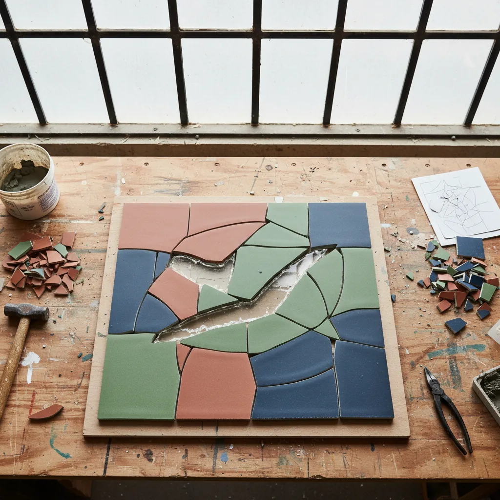
Hackney Mosaic Tile Craft Picker: 3 Texture Tests
Build a tactile abstract panel around clay, slate and a controlled flash of glass, with Hackney's changing textures as visual inspiration.
Texture should lead a Hackney mosaic panel: a rough clay field, a smooth ceramic band and a restrained glass accent give the eye three different speeds. Use this mosaic tile craft picker approach to compare surfaces before committing to a bag of colours. The contrast between brick, canal water and converted industrial forms around Hackney offers a visual starting point for an abstract piece, without turning a neighbourhood browsing day into a hunt for a particular shop's inventory.
A panel that earns its rough edges
Imagine the finished piece beside a shelf of books and plants. If the surface will be viewed closely, texture can carry much of the composition. A coarse patch invites inspection; a clean edge gives the eye somewhere to rest. Start with a simple rectangle and divide it into a large quiet area, a smaller middle band and a narrow interruption. These unequal territories create a hierarchy before any individual tessera is selected.
Avoid assigning a different material to every shape. That approach can make a small panel resemble a collection of leftovers rather than a considered arrangement. Instead, choose one dominant surface and let the others challenge it. For example, a mostly matte field with a single line of glass has a clear relationship. The reverse arrangement would make a different object: light would become the subject, with clay supplying a darker pause.
Three tests for the same colour
The first test is a side view. Hold permitted samples at a low angle and consider their thickness as well as their face. Pieces that look compatible from above may sit at noticeably different heights. Some relief can be an intentional feature in decorative work, but an accidental ridge is harder to justify. Bring a rough drawing of the intended object so that any discussion about backing and fixing methods has a concrete purpose.
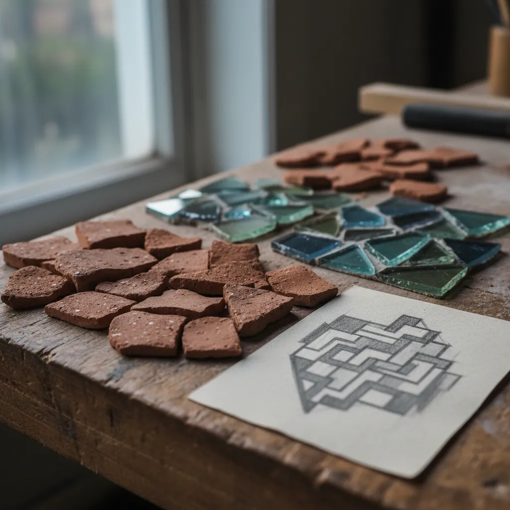
The second test is distance. Look at a small group from near enough to see its surface and then from the place where a visitor might stand. Roughness that is dramatic in the hand may disappear across a room. This is why tiny flecks of several similar colours are not automatically more expressive than a larger, simpler patch. If the texture vanishes at the intended viewing distance, its role must be reconsidered rather than defended because the individual pieces are attractive.
The third test is changing light. Rotate a sample gently under the light available to you, without assuming it reproduces your home. Gloss can exaggerate an edge and glass can produce a bright interruption. Think about whether that interruption belongs near the centre or somewhere less predictable. A little shine near an outside edge may pull attention out of the composition. A strip crossing an existing seam may tie separate sections together more effectively.
Borrow a rhythm from the canal
A self-chosen walk around the Regent's Canal can offer a useful study in alternating surfaces: solid edges beside moving reflections, broad stretches interrupted by small details. Translate that contrast into a sequence of areas, not a literal picture of the water. You might draw a long muted block with one rippling line passing through it. The idea is to borrow a relationship between stillness and movement, leaving room for the materials to behave like themselves.
Broadway Market and London Fields can be considered as other parts of a day you arrange independently. Their value to this project is a change in visual pace, from concentrated street detail to a broader open view. Pause to ask whether your panel needs more breathing space. You are not required to complete a circuit or link every possible stop. A short outing with one strong sketch can be more productive than collecting impressions until they cancel each other out.
Mixed pieces need an organising rule
Irregular fragments can work together when their boundaries obey a common idea. Try grouping angular pieces within broad, calm shapes, or keep a single sweeping seam through a patchwork field. Without that organising line, each fragment asks to be read separately. On paper, draw the seam with a thick pencil and cover it with a translucent sheet. If the basic composition disappears beneath the proposed detail, simplify the division before selecting more material.
A limited palette helps, but matching colour alone is not enough. Warm terracotta and cool slate can sit comfortably together if one has a dominant area and the other acts as a counterweight. Equal portions may produce a static split when you intended movement. Make paper cutouts to compare the balance. That costs little effort, allows quick changes and prevents the weight of already acquired pieces from deciding the composition for you.
Resist the seductive scrap pile
Skip a mixed assortment when the project depends on a smooth, controlled plane. Its variety may be appealing, yet a small decorative panel can become unnecessarily difficult if every piece creates another compatibility question. A more uniform starting material leaves creative energy for spacing and direction. Keep experimental scraps for a separate study if you want to explore them. Combining learning exercises with a gift deadline can make both tasks less enjoyable.
When browsing materials, ask about the requirements of the exact combination you are considering. Glass, ceramic, backing, adhesive and grout form a system, and product guidance matters more than a pleasing photograph. This article's texture tests are visual comparisons, not installation instructions. If cutting is part of the eventual project, use suitable tools and the protective equipment specified by their makers. Do not practise snapping unknown fragments on a public table or while carrying them between stops.
Use nearby recommendations as possibilities
Ask Karpo APP for nearby craft-related places in Hackney if you want local suggestions for the outing. You could say, "Recommend nearby places for browsing craft materials around Hackney." Choose the suggestions that appeal to you, and arrange your own sequence and transport. The panel sketch supplies the purpose of the visit; the app's role is recommending places nearby. A recommendation is a starting point for your judgment about where to spend your attention.
A browsing partner can help by taking the opposite role from yours. If you are drawn to every shiny fragment, ask them to defend the matte field. If you favour a perfectly quiet rectangle, let them suggest one interruption. Talk about the effect on the whole panel rather than voting on each piece. This turns the outing into a conversation about the object you want to make, instead of a competition to notice the most unusual material.
Practical notes for a useful ending
Bring a sturdy envelope for the sketch and a protected container for any authorised samples. Note which surface effect each sample represents in your own notebook: rough field, quiet band or reflective seam. If you find nothing suitable, leave with a revised relationship between those roles. The project can move forward through elimination. Rejecting a material because it distracts from the intended texture is a more useful outcome than choosing it just to finish the day with a purchase.
At home, put the proposal beside the actual wall, shelf or furniture that will surround it. Notice how the room changes the balance between warm and cool tones. Then remove one element and compare again. Hackney's varied surfaces offer plenty of visual energy; the maker's job is deciding how much the small panel can hold. A clear seam and a deliberately quiet area often do more for an abstract mosaic than another handful of fascinating fragments.
Ask Karpo for more information.
Keep reading
- Shoreditch Comic Shop Crawl Planner: Murals to Manga
 Bermondsey Comic Shop Crawl Planner: Zines Under the Arches
 Clapham Comic Shop Crawl Planner: Charity Shelves and Common