 Shoreditch Comic Shop Crawl Planner: Murals to Manga
Hidden Gems & Odd Finds

Brixton Mosaic Tile Craft Picker: 3 Colour Rhythms
A bold decorative medallion starts with readable shapes and warm colour: compare mustard, terracotta and violet before choosing the pieces.
Readable colour blocks make a decorative mosaic medallion more convincing than a handful of individually beautiful tiles. For a Brixton mosaic tile craft picker day, compare three rhythms: alternating bands, a dark shape on warm ground, or a scattered accent within a mostly quiet field. A flat medallion displayed beside a terracotta pot keeps the design exercise approachable. It also lets you explore the area's lively colour contrasts without making the curved pot itself your first construction problem.
Separate the ornament from the plant
Start with a removable decorative piece rather than assuming tiles should be attached directly to a flowerpot. A small flat panel can echo the pot's colours while remaining a separate object. That distinction matters visually as well as practically: the plant, the container and the mosaic each need some space. Draw the pot as a simple silhouette and place a paper medallion beside it. Compare a round shape with a broad oval before considering individual tesserae.
An initial or a simple abstract mark can give the medallion a personal purpose. Imagine making it for someone whose windowsill already has several plants, or for a housemate who likes bold colour but has little room for another large object. These are possible project briefs, not accounts of real customers. The useful question is which visual gesture the recipient would recognise: a clear letter-like shape, a repeated stripe or one warm patch of colour against dark ground.
Rhythm one: bands with a deliberate interruption
Alternating mustard and deep violet bands produce an immediate rhythm. Draw them with different widths so the result does not feel like a mechanically repeated stripe. Then interrupt one band with a small terracotta patch. If the interruption adds energy, keep it; if it resembles an error, remove it. The test is compositional, and paper allows you to change the relationship without worrying about wasting material or committing to a difficult junction.
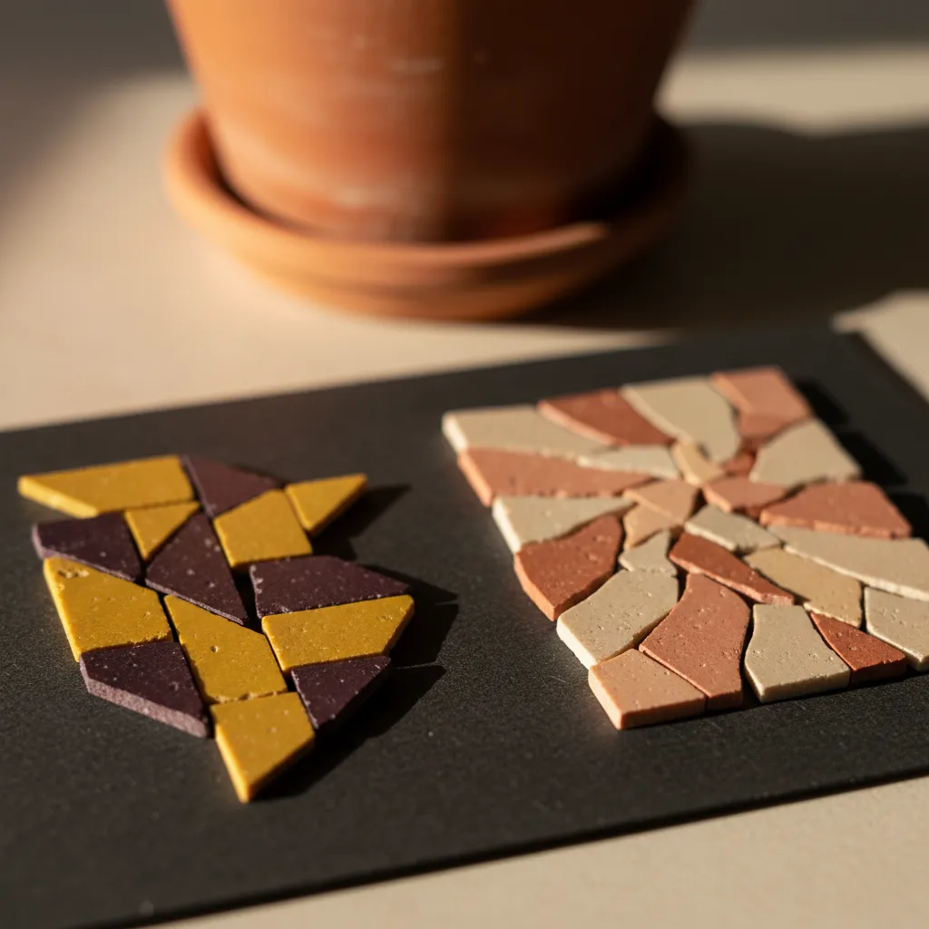
Bands can curve around an oval or cross it at an angle. Following the outer contour creates a contained, medallion-like effect, while diagonal stripes can make the shape feel more active. Choose one direction and keep it visible. A mixture of concentric and diagonal bands may be exciting on a large drawing but confusing at the scale of a plant ornament. The smaller the object, the more helpful a clear organising rhythm becomes.
Rhythm two: one dark mark on a warm field
For a personal initial, draw the mark in solid black and ignore decorative details. It should remain recognisable when reduced to the intended size. Thin lines and narrow enclosed spaces are likely to disappear once separated into tile-sized units. Broaden the strokes or simplify their turns before you browse. If an initial still needs explanation, consider an abstract shape with a strong silhouette instead. A personal gift does not have to carry a literal letter to feel considered.
Warm orange or peach around a dark violet mark can create clear separation, but colour names are only a starting point. Compare the lightness of the actual pieces. Two apparently different hues may merge when viewed from a distance if they share a similar value. A quick grayscale photograph of your own permitted sample arrangement can help you assess that relationship. Use it as a design aid, keeping the judgement tied to the samples and the light in which you made the comparison.
Rhythm three: a few bright pieces in quiet ground
The scattered-accent option works when most of the field has a stable character. Choose a dominant warm neutral, then cluster the brightest pieces rather than distributing them perfectly evenly. A small concentration can suggest movement across the medallion. Too many isolated highlights may make the surface feel restless without giving the eye a destination. Try removing half the accents from the paper version and see whether the remaining ones become more expressive.
This rhythm is useful if you enjoy subtle variation but do not want to form a recognisable letter. It also suits a composition that will sit beside patterned leaves, where a busy mosaic might compete with the plant. Look at the medallion and foliage together in your sketch. Their colours need not match. A deliberate contrast can make both more legible, provided one remains visually quieter. Decide which element should be noticed first and let that choice govern the balance.
Brixton offers a palette, not a shopping guarantee
Around Brixton's market passages and street frontages, you can look at the relationship between concentrated colour and darker intervals. Treat the area as a visual exercise, with your own observations guiding the sketch. The aim is not to claim a particular stall sells your chosen tiles or that every colourful surface has a craft counterpart. Notice broad relationships: a warm patch beside shadow, a repeated edge, or a bright detail that gains force because its surroundings are restrained.
If you choose a quieter pause around Windrush Square or continue towards Brockwell Park, look again at the medallion away from dense visual detail. A palette that felt lively in a busy setting may look harsher on its own. You can soften one colour, widen a neutral band or keep the original contrast. Decide your own stops and travel arrangements. The useful part of the outing is changing the context in which you judge the design, not completing a fixed chain of places.
Surface is a second palette
Matte ceramic, glossy glaze and glass reflect the same colour differently. For the pot-side ornament, a largely matte surface can relate gently to terracotta, while a few glazed pieces introduce a sharper note. Avoid selecting a shiny finish simply because it looks impressive in the hand. View a sample at the angle the medallion would occupy, and imagine the surrounding leaves and container. That wider relationship can make a quieter material the more satisfying choice.
Skip heavily varied mixed fragments if the initial is the central promise. Differences in thickness, shape and sheen can break the strokes into unrelated pieces. A more consistent material may give the letter room to read, with irregularity reserved for the background. Discuss the intended backing, display method and material combination with someone knowledgeable where available, and follow the relevant product guidance. Decorative proximity to a plant does not make the piece suitable for wet or outdoor conditions.
Nearby places, chosen for your own day
Karpo APP can recommend nearby craft-related places in Brixton. A simple request is, "Recommend nearby places for a craft-material browsing outing around Brixton." Consider the suggestions and select any that interest you. The colour comparisons, sketch and decisions about what to make stay with you. You choose the order of visits and how to travel, and can stop once the outing has answered the material question you brought with you.
If you are making the ornament for someone else, bring a nonprecious colour reference you already own, such as a fabric scrap or a paper swatch. Do not rely on memory for the difference between a yellow they enjoy and one they find overpowering. A friend can compare the reference against permitted samples while you assess the shape. Keep the conversation focused on the recipient's room and habits, allowing those details to matter more than your own attraction to an unusual glaze.
Practical notes for keeping the gift simple
Carry the paper silhouette, a short palette note and a protective container for any authorised samples. Leave the plant at home; its presence is unnecessary for the comparison and makes the outing cumbersome. When you eventually assemble the piece, handle edges carefully and use the tools and protection specified for the chosen materials. Keep the project as a separate decorative medallion unless you have an appropriate method for any different final use you decide to pursue.
Choose one colour rhythm before adding a personal flourish. If the dark mark is working, let the background stay calm; if the bands are the subject, the initial can disappear entirely. Bring the paper version back to the actual pot and plant before fixing the composition. Brixton's energy can inspire a bold palette without demanding a crowded object. A small, readable medallion with one confident colour relationship can feel more personal than an ambitious design whose many details obscure the original thought.
Ask Karpo for more information.
Keep reading
- Shoreditch Comic Shop Crawl Planner: Murals to Manga
 Bermondsey Comic Shop Crawl Planner: Zines Under the Arches
 Clapham Comic Shop Crawl Planner: Charity Shelves and Common