 Shoreditch Comic Shop Crawl Planner: Murals to Manga
Hidden Gems & Odd Finds

Islington Etching Paper Supply Picker: Choose for Fine Lines
Explore etching paper choices in Islington through fine lines, generous margins and subtle paper colour, with a practical brief for your next small edition.
A small etching can feel crowded long before the plate runs out of room. The border may be narrow, the paper too busy, or the colour slightly at odds with a pale ink. An Islington etching paper supply picker begins with that relationship between image and empty space. Take the scale of the finished work seriously, then let an independent browsing outing help you consider the sheet as part of the composition rather than a neutral surface beneath it.
Draw the border before choosing the sheet
Cut a window from scrap paper at home and place it around your proof or drawing. Try a broad lower margin, an even frame and a closer crop. The exercise needs no specialist equipment; it simply makes proportions visible. Note which arrangement suits the image before you begin browsing. A sheet that looks elegant by itself may become awkward once a plate mark, signature and comfortable handling space are imagined within its edges.
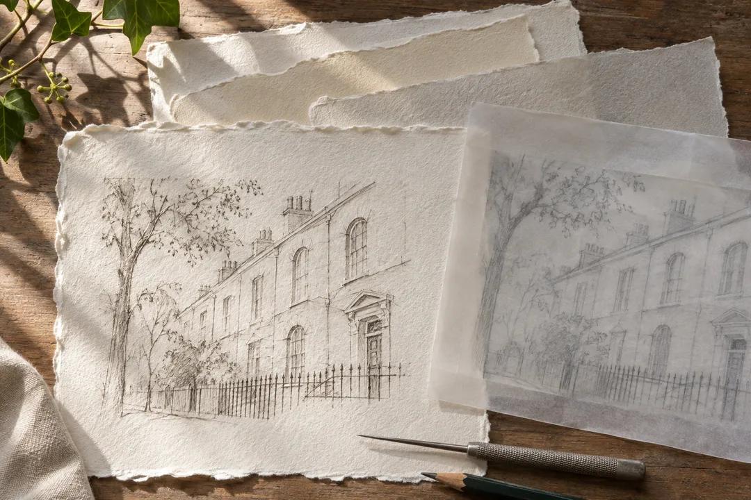
For a tiny architectural plate, you might want blank paper to feel as deliberate as the scratched lines. For a more intimate object study, a closer border might hold the viewer near the subject. Keep both versions in mind rather than deciding that generous always means better. Your aim is a proportion that supports attention. The physical size also affects the folder, table and storage space the finished edition will ask of you.
Use Islington as a lesson in intervals
Islington's brick facades and quieter residential edges offer a pleasant setting for noticing spaces between things. During a walk of your own choosing, look at the gap between windows, the rhythm of railings and the way a doorway sits within a wall. These are composition prompts, not a prescribed route. Sketch an interval that feels balanced. It may tell you more about a border than another round of comparing untouched sheets indoors.
If you choose a pause near the canal, consider the contrast between an intricate reflection and the open area around it. Some images need space to let the detail settle. Others gain energy from a close edge. Record the distinction in a few pencil shapes. Keep the actual paper packed away while you look; the point of this neighbourhood exercise is to clarify your eye, not to test a sheet outdoors under conditions you cannot control.
Paper colour is part of the ink decision
Bring a small inked reference or a colour swatch that belongs to the project. Compare the impression of the image beside a bright sheet and a warmer one. A warm paper can change the feeling of a cool mark, while a brighter surface may make a faint passage easier for you to notice. Describe what you see rather than borrowing words from a label. The most suitable shade is the one that serves this image.
Avoid evaluating colour in a rushed sequence where every new sample replaces the previous one in memory. Place a manageable pair beside each other when permission and space allow. Look away, then return to the same pair with your reference. Does one make the blank area feel more active? Does another push the ink toward a tone you did not intend? Those concrete observations create a useful record even if you leave without choosing a full sheet.
Give the fine line a fair trial
A paper's surface can look luxurious while competing with the finest marks in a delicate plate. Look at the grain from several angles and consider how much texture you want the viewer to see. Ask material questions related to the process you use, and keep any actual printing trial for an appropriate workspace. Handling alone cannot promise the appearance of an edition. It can help you decide which candidate deserves the next experiment.
If you later compare prints, include a pale passage, a cluster of close lines and an area of open paper in the judgment. Looking only at the darkest mark can miss the part of the image most sensitive to the sheet. Keep the test results together after they dry so you can compare them in the same light. A strong decision will account for the whole composition, including the quiet space that was easy to overlook at first.
Make an edition brief that fits in a pocket
Write the image dimensions, the intended margin and the kind of handling the work will receive. A print intended for a portfolio asks different practical questions from one you want to give to a friend. Consider where it will lie flat and whether the finished size fits the protective materials you already own. These details need not make the outing feel administrative. They remove distracting decisions so there is more room to enjoy looking at paper.
For a shared edition, agree which qualities are essential before browsing with another maker. You might prioritise a consistent colour, comfortable handling and enough room around the plate mark. Let each person name a preference that can remain flexible. That distinction prevents an attractive new sample from reopening every earlier choice. It also makes disagreement productive: you can discuss the image's needs without treating personal taste as a universal rule about good paper.
Nearby recommendations leave the choice with you
Use Karpo APP to find nearby art material places in Islington. Ask for recommendations around the neighbourhood, then consider which suggestions fit the sort of browsing you want to do. You choose the places to visit and arrange your own travel. A short written brief remains useful alongside those recommendations because it keeps the visit connected to the print, whether you encounter a promising material or simply learn what you would like to try later.
Build an enjoyable pause into your own outing. A companion can bring a postcard or a book jacket and compare how its empty space works, while you study your paper notes. The conversation may move away from technical printmaking for a while, which can be useful. When you return to the image, ask whether the border now feels calm, hesitant or cramped. Ordinary visual language often reaches the decision faster than another list of material adjectives.
Practical notes for a calm finish
Carry a rigid support, clean hands and a pencil rather than a loose pen near unprotected paper. Handle only what you have permission to touch, and keep identifying information with any sample you obtain. Decide how much material you can store flat before making a large purchase. Your notes should distinguish a surface you liked in the hand from one you have actually printed, so a pleasant first impression does not become an unsupported promise to yourself.
At home, place the chosen trial sheet beneath the same paper window you made at the beginning. The small circle of decisions should now feel coherent: line, colour, border and scale. If something still jars, revise the trial rather than forcing the image into an unsuitable format. An Islington outing can end with a better question instead of a heavy folder. That is progress when the next proof will have more room to breathe.
Ask Karpo for more information.
Keep reading
- Shoreditch Comic Shop Crawl Planner: Murals to Manga
 Bermondsey Comic Shop Crawl Planner: Zines Under the Arches
 Clapham Comic Shop Crawl Planner: Charity Shelves and Common