 Shoreditch Comic Shop Crawl Planner: Murals to Manga
Hidden Gems & Odd Finds
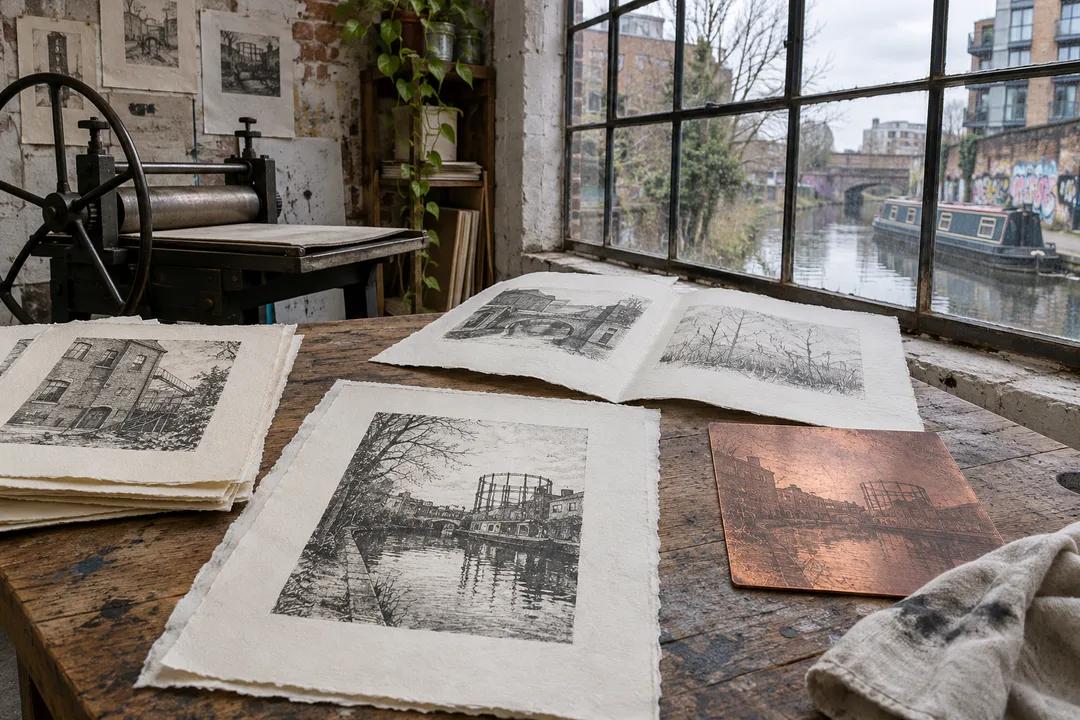
Hackney Etching Paper Supply Picker: 3 Surface Choices
Compare etching paper textures for a Hackney browsing outing, from delicate line work to soft plate tone, and choose materials for your next print.
The difficult part of an etching paper supply picker in Hackney is often deciding what the print should feel like before looking at another sheet. A plate full of wiry lines asks a different question from a broad, smoky image. Start with a fragment of your own work and a short description of its mood. Hackney's brick, water and workshop textures can become prompts for looking closely, while the material decision stays tied to the image you intend to print.
Begin with the palest mark
Imagine a small plate built around a fading canal reflection. Its lightest scratches matter as much as its dark edge. Put that concern at the top of a handwritten brief: preserve the pale line. You now have a useful reason to compare surfaces. The most dramatic deckle or creamy colour can wait until you know whether the sheet gives those faint marks enough quiet space to remain visible beside the heavier passages.
Carry a dry proof if you have one, protected between clean boards. Without a proof, take a drawing that shows the balance of blank paper and ink you want. This is your reference, not evidence that any nearby supplier offers a particular material. A person browsing with you can hold the image while you study samples, so the conversation remains about a shared visual problem instead of the appeal of a stack of untouched paper.
Let texture have a job
A smooth surface is worth considering when you want the eye to follow fine, close lines without interruption. A more pronounced grain can become part of a loose, atmospheric image. Neither description is a verdict. Think about whether the paper should disappear behind the plate or lend it another texture. If the original drawing already contains restless marks, an assertive sheet may add more activity than the composition needs.
Use three descriptive words rather than a vague preference for quality. You might write quiet, flexible and warm, then compare each candidate against those words. One sample may feel pleasantly substantial yet too rigid for the way you handle proofs. Another may offer a gentle colour that changes the apparent warmth of the ink. Keep those observations distinct; a pleasing touch and a useful printed result are related questions, but they are not interchangeable.
Read Hackney with a printmaker's eye
Between material browsing stops that you choose yourself, let the neighbourhood supply a small exercise in contrasts. Look at the edge of a brick wall, a dark window and the blank interval of sky above it. Which part would become a sharp line, and which would become a broad tone? You need no finished sketch. A handful of thumbnail shapes can reveal whether your current plate needs a calmer paper surface or a more expressive one.
If a canal-side pause appeals, decide for yourself whether it suits the day and your energy. Keep loose sheets inside their folder while looking around. Damp air and an open bag make an awkward combination for paper browsing, even when the scene looks irresistible. Record colour and shape in a pocket notebook instead of exposing the material samples. The outing should sharpen your attention without making the paper responsible for carrying the whole atmosphere home.

Compare samples without turning them into souvenirs
Ask permission before handling a sample, and support a larger sheet with both hands. Avoid rubbing a surface to demonstrate how soft it feels. A gentle look across the sheet in angled light can be more useful than repeated touching. Notice irregularities, the edge and the overall feel, then write the paper's identifying information from its packaging or label. Do not assume that a sample represents something available for purchase during your visit.
Choose a small comparison set with clearly different roles. One candidate might serve precise line work, another a softer image, and another an exploratory proof. Too many almost identical options can blur your judgment. Give each one a reason to be considered and a reason it might be set aside. This turns an attractive assortment into a practical decision and gives you a way to explain the choice when you return to the press.
Keep the wet test for a suitable workspace
Texture in the hand cannot tell the entire story of a printed sheet. If your process involves dampening, reserve the relevant comparison for a workspace where water, drying and printing can be controlled appropriately. Follow the material guidance you actually receive rather than adopting a universal soaking rule. The useful question is how that particular paper behaves in your own process. A browsing trip can narrow the candidates without pretending to finish the experiment.
During a later trial, change one variable at a time where possible. Keep a note of the plate, ink and handling method beside the result. Look at the pale line again after the sheet has settled and dried. Did the surface support the feeling you wanted? Was the border still comfortable around the image? A modest trial that answers those questions is more valuable than a confident prediction made while standing beside a paper display.
Find nearby possibilities, then choose your outing
Ask Karpo APP for nearby art material places around Hackney. A useful request is simple: discover nearby places for browsing printmaking materials. Treat the recommendations as possibilities to consider alongside your own project brief. You decide which places interest you, whether to make a visit, and how to travel between them. Keep your material comparisons in your own notebook so the reasoning stays easy to revisit at the worktable.
Give a companion a separate visual task if they are less interested in paper: choose a colour from the street that would work beside your ink, or draw the border they would give the image. Compare those ideas during a pause you select. Their response can reveal what the print communicates before technical language takes over. A material outing becomes more enjoyable when there is room for another person's curiosity as well as your own precise questions.
Practical notes for the return to the plate
Pack a clean folder that supports the largest sheet you are willing to carry, a pencil and a short project note. Leave room for the protective packaging a purchase might require. If carrying a full sheet would make the rest of your day awkward, choose a smaller experiment or defer that decision. The right scale is the one you can handle comfortably from browsing through storage, rather than the largest piece that looks impressive on a table.
Finish by giving the chosen paper a sentence: this surface earns a trial because it leaves the delicate line quiet and lets the dark area breathe. Keep the rejected candidates' useful qualities in your notes without buying every possibility. Back at the press, the actual print will have the final word. Hackney has supplied a setting for looking, and you have brought home a focused material question that can be answered through making.
Ask Karpo for more information.
Keep reading
- Shoreditch Comic Shop Crawl Planner: Murals to Manga
 Bermondsey Comic Shop Crawl Planner: Zines Under the Arches
 Clapham Comic Shop Crawl Planner: Charity Shelves and Common