 Shoreditch Comic Shop Crawl Planner: Murals to Manga
Hidden Gems & Odd Finds
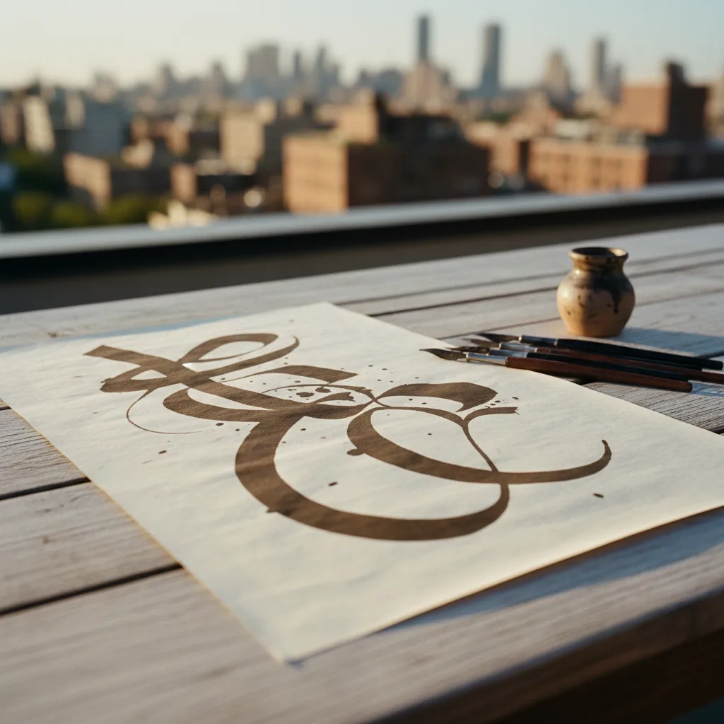
Peckham Calligraphy Nib Flex Picker for Big, Bold Letters
For large poster-scale lettering, weigh nib size, ink load and paper sizing as carefully as flex, then take your sample sheets through Peckham's creative streets.
Writing big with a pointed pen is a different job from writing small, and the nib that sings at envelope size can starve, flood or splay when you scale up to a poster headline. A calligraphy nib flex picker in Peckham should therefore begin with ink capacity and stroke length as well as flex. Peckham, known for its studios, open rooftops, galleries and colourful market streets, is a natural setting for people who letter at a large, expressive scale and want their tools to keep up.
Why scale changes the whole equation
A long downstroke at a large x-height asks the nib to stay open, and stay inked, for much longer than a small stroke. A slender, very flexible nib may give a gorgeous swell for the first centimetre and then run dry halfway down. A larger nib with a longer slit and a bigger reservoir area can hold more ink and sustain the shade, though it often feels firmer at the start of the stroke.
So the first question is not "how flexible is it" but "how far can it carry a wide line". Picture the tallest letter you plan to draw, then imagine pulling the shade from top to bottom in one breath. That single stroke is the real test your nib needs to pass.
Big nibs, small nibs and the middle ground
Small, fine nibs excel at detail and hairlines but have little room for ink. Large nibs carry more ink and can produce wide, confident shades, but their hairlines are usually thicker and they may feel stiff until warmed up by use. Some calligraphers keep one big flexible nib purely for display work and another fine nib for detail, rather than forcing one tool to do everything.
If you are new to large lettering, choose a medium-sized nib with clear flex and good snap as a starting point. It will teach you how pressure translates into width without the extra drama of a giant point. Once you understand your hand, a bigger display nib becomes a deliberate upgrade rather than a gamble.
Ink load: the hidden partner of flex
How you load ink changes what flex can do. Dipping too deep floods the vent and causes blobs at the start of strokes, while dipping too shallow starves the shade halfway. Many letterers brush or eyedrop ink onto the underside of the nib for an even, controlled load. Thicker inks, or ink with a touch of gum arabic, cling better to the tines and give smoother big shades.
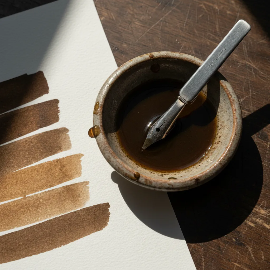
Walnut ink and other thin, earthy inks are popular for large work because they look rich and warm, but they flow quickly and can overwhelm a very soft nib. If your favourite ink feels too runny, consider a firmer nib, a thicker ink, or simply letting the opened bottle thicken slightly before a session.
Paper sizing matters at large scale
Large shades deposit a lot of ink in one place, which is exactly where weak paper fails. Soft, unsized paper lets ink feather into fuzzy edges and may even tear when a sharp nib digs in. Well-sized, smooth paper keeps the edges crisp and lets hairlines glide back up the page. Heavier watercolour papers can work, but their texture can catch the point on upstrokes.
Test every new paper with your chosen nib before committing a whole poster to it. A single page of large ovals and long downstrokes will reveal feathering, snagging or ink pooling far faster than writing small words. Keep that test page as a reference, labelled with the nib and ink you used.
Peckham's creative rhythm
Peckham has a lively, informal creative energy. Rye Lane is busy, colourful and full of independent traders, while Bellenden Road feels calmer, with a village-like mix of cafes and small shops. Studios, gallery spaces and maker workshops are scattered through the area, and Peckham Rye Common offers open grass where you can sit with a sketchbook and look through your test sheets in daylight.
The neighbourhood suits people who letter for posters, zines, signage experiments and gig flyers. That kind of work favours bold contrast and confident strokes, and the visual culture here, from painted shopfronts to exhibition posters, is a good reminder of how large letterforms read at a distance. Let that inform how much swell you really need.
A large-scale test you can repeat
Rule two guidelines far apart, at the height of a real headline, and pull five long downstrokes in a row with steadily increasing pressure. Then write one large capital and one short word. Watch whether the nib maintains ink to the bottom of the stroke, whether the tines stay aligned at full pressure, and whether the hairline on the way back up is still clean.
Repeat the same test with two or three nibs and one ink. The best choice for poster work is usually the nib that holds a consistent shade from top to bottom, even if it is slightly less dramatic at maximum flex. Reliable width across a long stroke reads far better on a wall than one spectacular swell that fades.
Who should try this approach
This scale-first method suits illustrators adding lettering to large artwork, event organisers making their own signs, sign-painting enthusiasts exploring pointed pen, and students working on typography projects that need hand-drawn display type. It also helps anyone who loved small calligraphy but felt disappointed the first time they tried to make it big.
If most of your work is small, such as journalling or addressing envelopes, you do not need a big display nib at all. Spend that effort on a fine nib with excellent snap instead, and come back to large work later when you have a clear project in mind.
A frank skip and a sensible fallback
Skip the oversized novelty nibs sold mostly as decorative curiosities. Some are lovely, but many have rough tines or uneven slits that snag at scale. A modest, well-made nib used with good ink and properly sized paper will outperform a dramatic shape almost every time, and it will be easier to replace when it wears out.
If your large letters keep failing, the fix may be paper or ink rather than another nib. Try a different sheet before buying more steel. When you want ideas for nearby art supply shops, paper sellers or print studios around Peckham, Karpo APP can share nearby recommendations, and you decide which ones suit your project and how you get there.
Practical notes for poster-scale practice
Bring a long ruler, a few large sheets you already trust, and a damp cloth for wiping thick ink from the tines between strokes. Work standing or with your arm free to move, since large strokes come from the shoulder and elbow rather than the fingers. Keep your nib clean during long sessions, because dried ink at the slit quietly reduces flex.
After each session, wash big nibs thoroughly, especially if you used gum arabic or pigment-heavy ink, and dry them completely to avoid rust. Note which combination of nib, ink and paper produced your best large letters. That small record becomes the most valuable tool in your kit the next time a poster project lands on your table.
Ask Karpo for more information.
Keep reading
- Shoreditch Comic Shop Crawl Planner: Murals to Manga
 Bermondsey Comic Shop Crawl Planner: Zines Under the Arches
 Clapham Comic Shop Crawl Planner: Charity Shelves and Common