 Shoreditch Comic Shop Crawl Planner: Murals to Manga
Hidden Gems & Odd Finds
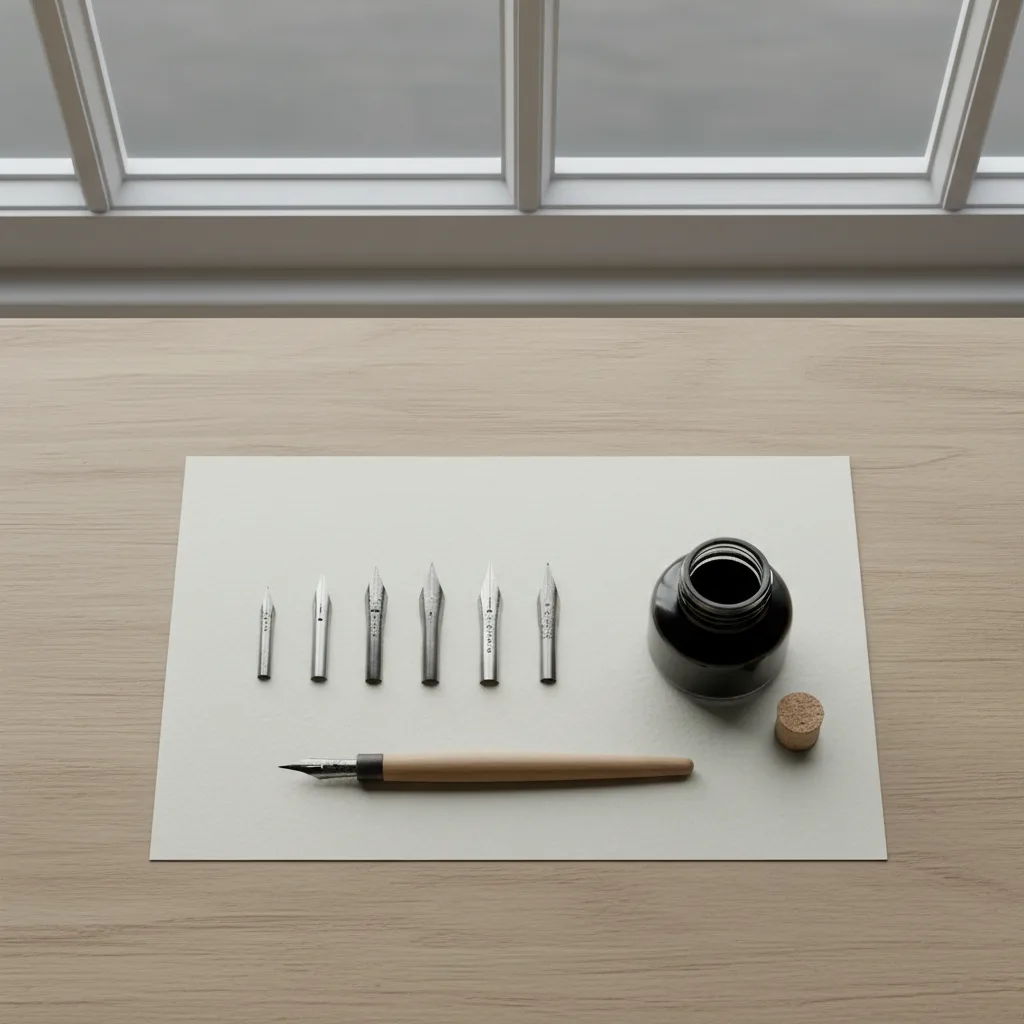
Islington Calligraphy Nib Flex Picker: Test Hairlines First
A Georgian-square approach to choosing a pointed dip nib: learn the flex scale, test hairlines before swells, and browse Upper Street at your own pace.
A pointed dip nib is two thin steel tines and a slit, and the amount those tines spread under pressure decides almost every line you will ever write with it. That is why a calligraphy nib flex picker in Islington starts with hairlines, not with the dramatic thick strokes everyone photographs. If a nib cannot make a clean, whisper-thin upstroke, its swell on the downstroke hardly matters. Islington, with its Georgian terraces, antique lanes and long, browsable high street, suits a slow, testing mindset rather than a quick grab.
What flex actually means on paper
Flex is the distance the tines open when you press, and how willingly they close again when you lift. A very flexible nib opens with feather-light pressure, so a relaxed hand produces bold shades. A firmer nib needs real weight before the line grows, which gives a nervous beginner more control and fewer accidental blobs. Neither end is better. Your hand pressure, your script and the size you like to write all push the choice one way or the other.
Snap is the second half of the story. A nib with good snap returns to a fine point the instant you release pressure, so the transition from shade to hairline is crisp. A nib with weak snap lingers open, and the exit stroke looks soft and fuzzy. When people describe a nib as "mushy", this is usually what they mean. Pay attention to how quickly the line thins, not only how wide it gets.
A simple vocabulary before you browse
Calligraphers loosely sort pointed nibs into firm, medium and very flexible. Firm nibs are forgiving for everyday practice, envelope addressing and anyone who presses hard by habit. Medium nibs give visible contrast without demanding a feather touch, and they are often the most comfortable all-rounders for copperplate and modern pointed pen styles. Very flexible nibs reward a light, trained hand and make the most expressive shades, but they punish heavy pressure with splayed tines and railroading lines.
Write those three words on a scrap of paper and note which one you think you are. Then note which one your last frustrating practice session suggested. If your shades looked timid, you may need more flex. If your lines kept splitting into two parallel tracks, you were probably asking a flexible nib to carry more pressure than it wanted.
Reading a nib before you ink it
You can learn a surprising amount just by looking. A long, slender tine profile with a generous slit usually flexes more than a short, stubby shape. A large vent hole near the base tends to make the tines easier to spread. A broad shoulder and a short slit usually signal a firmer, more dependable workhorse. These are tendencies rather than rules, but they help you shortlist which nibs deserve a trial on paper.
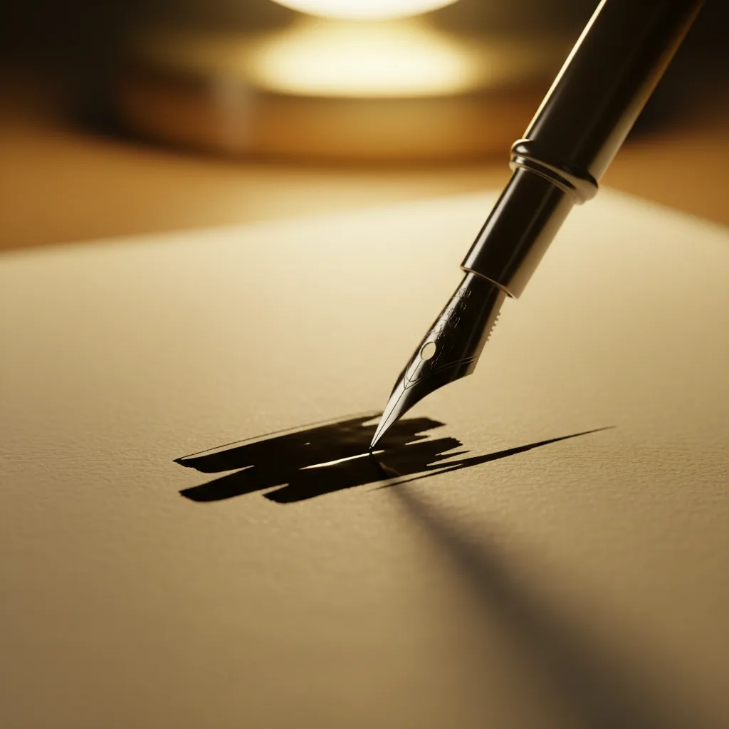
Hold each nib up to the window light and check that the two tines meet evenly at the point. If one sits higher than the other, the nib will catch on upstrokes no matter how flexible it is. A tiny misalignment can sometimes be eased, but as a buyer you are better off moving on to the next one in the tray.
The hairline test comes first
If a shop or a workshop lets you try nibs, start with three slow upstrokes at a gentle angle, pressing as little as possible. A good nib for your hand will glide upward without scratching, snagging the paper fibres or spraying tiny dots. Only after that should you try a downstroke, building pressure gradually and releasing it again before the bottom of the stroke.
Watch the transition zone. You want the line to swell smoothly and thin out again without a step or a jolt. If the swell arrives suddenly, the nib may be more flexible than your hand can manage right now. If it barely changes width even with firm pressure, it is too stiff for expressive scripts and better kept for monoline drills.
Islington as a browsing neighbourhood
Islington rewards people who like to look closely. Upper Street runs as a long spine of independent shops, cafes and bookish storefronts, while Camden Passage tucks antique dealers and curious small traders into a narrow pedestrian lane. Around them, quiet Georgian squares give you benches where you can pause, open a notebook and compare the nibs you have already seen without anyone hurrying you along.
The mood here leans unhurried, the kind of place where people browse fountain pens, notebooks and prints on a weekday afternoon. That makes it a pleasant setting for a nib errand, because flex is something you judge slowly. Treat the area as a series of small, separate stops rather than a single shopping mission, and give each stop enough time for a proper look in daylight.
Holders, ink and paper all change the result
The same nib can feel flexible in one setup and stiff in another. A straight holder works well for many modern styles, while an oblique holder angles the nib so that slanted scripts feel more natural for right-handed writers. Check that any holder you choose grips the nib firmly without crushing the base, since a wobbly fit makes even a fine nib feel unpredictable.
Ink and paper matter just as much. Thin, watery ink flows quickly and can flood a very flexible nib, while a slightly thicker ink clings to the tines and gives cleaner shades. Smooth, heavy paper lets hairlines glide, whereas rough or soft paper invites snags. If you are comparing nibs, try them on the same sheet with the same ink so the nib is the only variable.
Who this approach suits
This hairline-first method suits returning beginners who abandoned calligraphy after a frustrating first set, office workers who want a calm evening hobby, and wedding stationery hobbyists who need consistent lines across many envelopes. It also helps experienced writers who own a drawer of nibs but never pinned down why some feel wrong. The habit of naming flex, snap and tine alignment tends to make every later choice faster.
If you are a heavy-handed writer, be honest about it and start with firm or medium nibs. You can always move toward more flex once your pressure control improves. Buying the most flexible nib on the tray first is the most common way people end up with a jar of splayed, unusable points.
An honest skip and a fallback
Skip the elaborate decorative nibs shaped like towers, hearts or crowns unless you collect them. They make striking display pieces, but their flex is often unpredictable and they rarely suit daily practice. Spend your attention on two or three plain, well-regarded workhorse shapes, one firm, one medium and one more flexible, so you can feel the difference between them.
If nothing on a given afternoon feels right in your hand, that is useful information too. Leave with notes rather than a bag of maybes, and try again on another day. Karpo APP can suggest nearby stationers, art supply shops and craft spots in Islington and the surrounding areas, while you decide which ones to visit and how to get there.
Practical notes for your nib outing
Bring a small pad of the smooth paper you normally practise on, a pencil for notes, and a cloth for wiping tines between tests. Write the same short word each time so comparisons stay fair. Record three things for every nib you try: how easily the hairline moved, how quickly the swell appeared, and how cleanly the line snapped back.
Back home, rinse new nibs gently to remove any factory coating that resists ink, dry them carefully and store them separately so the tines stay aligned. Practise with your chosen nib for a week before judging it, because hands adapt. A flex picker's real reward is not one perfect nib, but the confidence to know why a nib works for you.
Ask Karpo for more information.
Keep reading
- Shoreditch Comic Shop Crawl Planner: Murals to Manga
 Bermondsey Comic Shop Crawl Planner: Zines Under the Arches
 Clapham Comic Shop Crawl Planner: Charity Shelves and Common