 Shoreditch Comic Shop Crawl Planner: Murals to Manga
Hidden Gems & Odd Finds
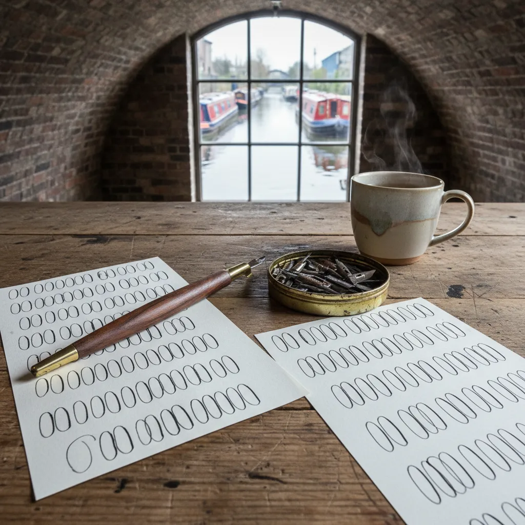
Hackney Calligraphy Nib Flex Picker: Fit Flex to Script
Pair nib flex with script size and holder angle before a Hackney browsing day, from slender copperplate points to sturdy nibs for loose modern letters.
Most nib frustration comes from a mismatch, not a bad nib: a very flexible point asked to write tiny business-hand notes, or a stiff workhorse pushed to make the fat shades of a big copperplate capital. The quickest way to use a calligraphy nib flex picker in Hackney is to decide which script you actually practise, how large you write it, and which holder you hold, and only then look at flex. Hackney, with its canal towpaths, market streets and workshop arches, is a good place to think like a maker about that match.
Start with the script, not the nib
Different pointed pen hands want different amounts of flex. Classic copperplate and engraver's script rely on strong contrast between hairline and shade, so they reward a nib that opens generously. Spencerian is lighter and more delicate, with shades used sparingly, so a medium nib with fine hairlines often feels better. Modern bouncy lettering can go either way, but many people enjoy a firmer point because their strokes are quicker and less controlled.
Write down the one style you most want to improve this season. If you jump between three, choose the one you practise most often. A nib chosen for a real habit will earn its place on the desk, while a nib chosen for a style you might try someday tends to rust in its tin.
Letter size changes how much flex you need
Size is the overlooked variable. At a small x-height, a very flexible nib can open so wide that the counters of letters like a, e and o fill with ink. At a large x-height, a stiff nib may never reach the dramatic shades that make the letters look intentional. Flex is relative to the scale you write, which is why the same nib can seem perfect to one calligrapher and impossible to another.
A useful home test is to rule guidelines at the size you usually write, then try a short word such as minimum, where the repeated strokes reveal any inconsistency. If shades crowd the gaps between downstrokes, try a firmer nib or write larger. If the word looks flat and monotone, you have room for more flex.
Straight or oblique: the holder decides the angle
Holders shape how flex behaves because they control the angle at which the tines meet the paper. An oblique holder sets the nib off to one side, helping right-handed writers keep both tines evenly on the page for steep, slanted scripts. A straight holder keeps the nib in line with the shaft, which many left-handed writers and modern letterers find more natural.
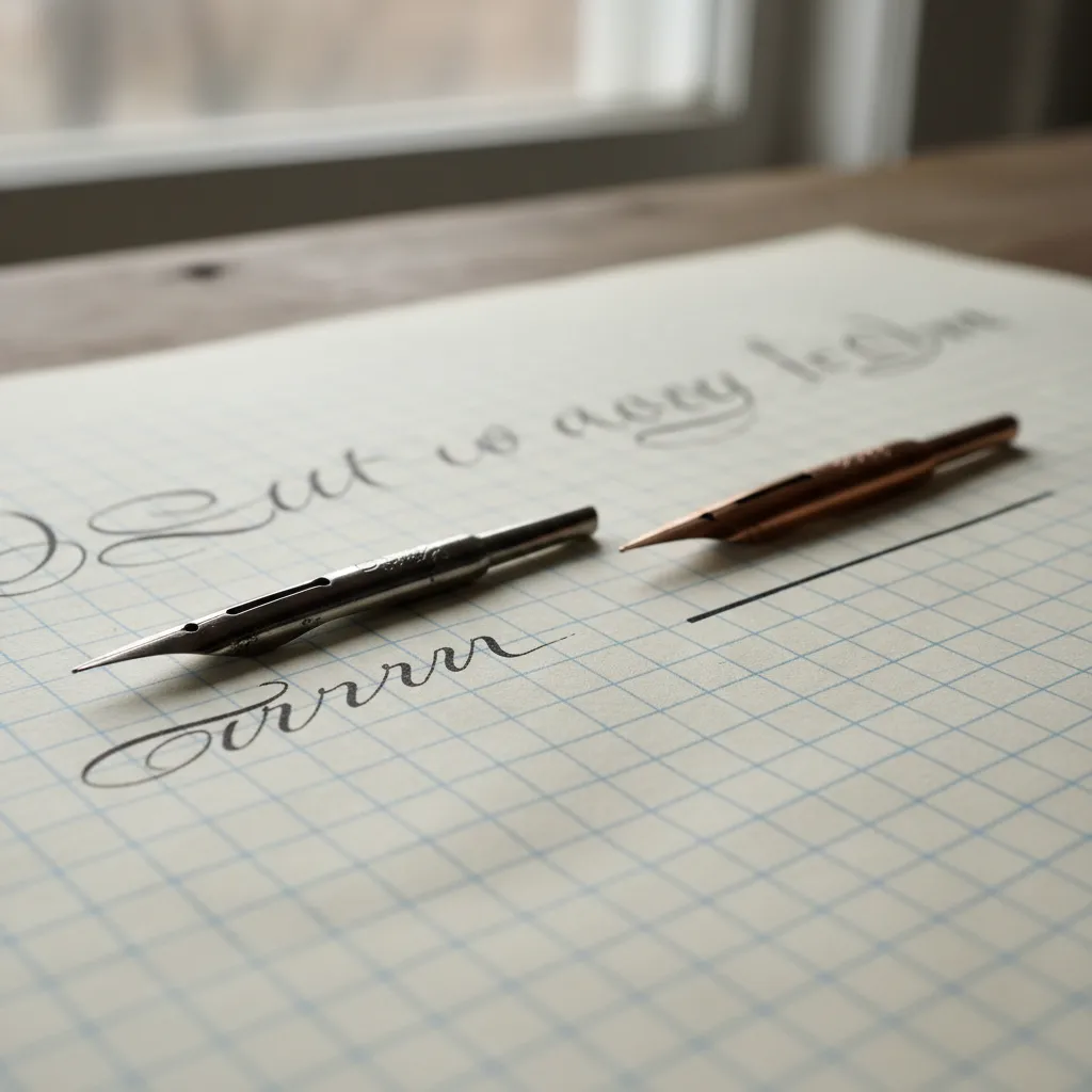
When the angle is wrong, one tine carries more weight than the other. The result looks like a flex problem, with ragged shades or a scratchy upstroke, even though the nib itself is fine. Before you blame a point for being too stiff or too soft, check that your holder lets it sit squarely on the paper.
Fitting nib and holder together
Not every nib suits every holder. Larger nibs need a flange or collet that grips them without forcing the base, while smaller, narrower nibs can slip around in a generous fitting. A loose nib rotates slightly as you press, and that rotation feels like unpredictable flex. A crushed nib, on the other hand, loses its spring entirely.
If you bring your own holder when you browse, you can check the fit directly. Slide the nib in, press gently on a scrap of paper, and watch whether it stays aligned. A secure fit should feel boring: the nib moves only when the tines spread, not when your hand twists.
Hackney's workshop mood
Hackney has a strong maker atmosphere, with studios tucked into railway arches, weekend crowds along Broadway Market, and long walks beside the Regent's Canal toward Victoria Park. It is the kind of area where people talk about materials, process and technique, and where a stationery errand can sit naturally beside a coffee, a print studio visit or a stroll across London Fields.
That workshop mood suits nib choice, because the right question is practical rather than aesthetic. Instead of asking which nib looks nicest in a tin, ask which one will survive your practice sheets, your paper and your pace. Take your time between stops and use the green spaces as places to review your notes.
A three-nib comparison that tells you a lot
Rather than testing a dozen nibs at once, choose three: one you would call firm, one medium and one notably flexible. Use each to write the same word at the same size, with the same ink and on the same paper. Lay the three samples next to each other and compare the darkest shade, the cleanest hairline and how even the letter spacing looks.
You will often find that the middle option feels best, not because it is perfect but because it forgives small changes in pressure. Treat that middle nib as your practice baseline, then use the firm and flexible nibs as tools for specific tasks, such as fast addressing or large display capitals.
Who benefits from this method
This match-first approach helps self-taught letterers who learned from videos and never compared nibs systematically, makers who want to add hand lettering to prints or packaging, and anyone moving from brush pens to a dip pen for the first time. It also helps people who practise in short bursts after work, since a well-matched nib cuts down the time spent fighting ink and paper.
Left-handed writers deserve special mention. Many find that the advice to buy an oblique holder does not fit their grip, and that a straight holder combined with a medium nib works far better. Comparing setups calmly, rather than copying a right-handed tutorial, is often the turning point.
What to skip and when to stop
Skip the temptation to buy holders and nibs as a full matching set purely because they look coordinated. A beautiful holder that grips your favourite nib poorly is a worse tool than a plain one that fits. Likewise, skip any nib that scratches on its very first gentle upstroke, even if everyone online praises it; your paper and hand may simply disagree.
If an afternoon of browsing leaves you unsure, stop and practise with what you already own for a few more days, then return with sharper questions. When you want ideas for where to look next, Karpo APP can recommend nearby craft supply shops, stationers and studio spaces around Hackney, and you choose which to visit and in what order.
Practical notes for a Hackney nib errand
Carry a ruled practice sheet at your usual x-height, the holder you already like, and a small jar or pen-friendly ink pot if you test at home afterwards. Label every sample with the nib name or a quick sketch of its shape, because after the fifth test they all start to look alike. A small zip pouch keeps loose nibs from bending in your bag.
At home, clean and dry nibs after every session, and store them flat or upright in a lidded tin so the tines never touch other metal. Revisit your three-nib comparison after a month. As your pressure control grows, you may find yourself reaching for more flex, and the notes you made in Hackney will tell you exactly how far to go.
Ask Karpo for more information.
Keep reading
- Shoreditch Comic Shop Crawl Planner: Murals to Manga
 Bermondsey Comic Shop Crawl Planner: Zines Under the Arches
 Clapham Comic Shop Crawl Planner: Charity Shelves and Common