 Shoreditch Comic Shop Crawl Planner: Murals to Manga
Hidden Gems & Odd Finds
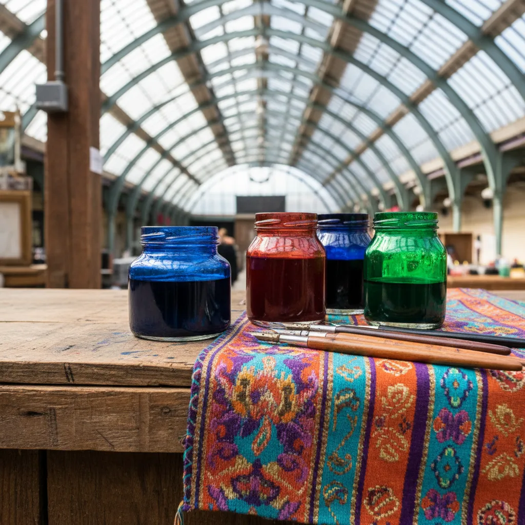
Brixton Calligraphy Nib Flex Picker: Coloured Inks and Paper
Coloured inks, metallics and gouache change how a flexible nib behaves, so test pigment, paper and flex together before a browse through Brixton's arcades.
Change the ink and you change the nib: a point that writes crisp black hairlines can turn sluggish with gouache, or flood with a thin coloured ink, even though the steel has not changed at all. That is why a calligraphy nib flex picker in Brixton should test colour, paper and flex as one system rather than three separate purchases. Brixton's covered arcades, colourful market streets and busy creative scene make it an inviting place for anyone who letters in more than one shade.
Why colour complicates flex
Black sumi-style and iron gall inks have been the standard companions of pointed pen work for good reason: they flow predictably and give clean edges. Coloured inks behave in many different ways. Some are thin and fast, racing off the nib and flooding swells. Others, especially pigment-heavy or metallic inks, are thicker and grittier, which can clog the slit and make the nib feel stiffer than it really is.
So when a nib feels wrong with a new colour, the nib may not be the problem. Before replacing it, ask whether the ink is too thin, too thick, or separating in the bottle. Stirring, slightly thinning or slightly thickening the ink often restores the flex you expected.
Gouache, metallics and thin dyes
Gouache mixed to a creamy consistency is a favourite for bright, opaque lettering on dark paper. It clings well to the tines but dries quickly, so it rewards a nib with moderate flex that does not need extreme pressure. Very flexible nibs can work beautifully with gouache, as long as you clean the slit often to stop pigment hardening inside.
Metallic inks add shimmer but carry fine particles that settle and can scratch on rough paper. Keep them well mixed and pair them with a smooth, firm-ish nib. Thin dye-based coloured inks flow freely and suit fine hairlines, but on a very soft nib they may pool at the bottom of shades. A slightly firmer point usually calms them down.
Paper colour and texture change the picture
Writing on dark or coloured paper is part of the fun of colour work, but the paper's surface matters as much as its hue. Smooth, well-sized papers let the nib glide, producing clean hairlines even with flexible points. Textured or soft papers drag at the tines, which makes a flexible nib feel unpredictable and can tear the surface during strong shades.

Try your nib and ink on a small offcut of each paper before committing to a finished piece. A quick row of upstrokes, downstrokes and a single word will show whether the combination feathers, snags or behaves. Keep a small swatch book of the combinations that worked so you can repeat them later.
A colour-and-flex swatch test
Set out two or three nibs, three inks you actually want to use, and one paper. On a single sheet, write the same short word with every nib and ink pairing, keeping size and pressure as consistent as you can. Label each sample in pencil. This grid makes it easy to see which nibs stay crisp with which inks and which combinations struggle.
Look for three things in every square: a clean hairline without dots or scratches, a smooth swell without pooling, and a quick return to a fine point. The winning nib is the one that performs reasonably across most of your inks, not the one that shines with only one of them.
Brixton's colourful browsing atmosphere
Brixton has an energetic, colourful character. Brixton Village and Market Row spread small traders and food stalls under glass-roofed arcades, Electric Avenue carries the bustle of the street market, and Windrush Square offers a central open space to pause. When you want greenery and quiet, Brockwell Park is close enough for a reflective sit with your swatches and notes.
That vibrancy is fitting for colour-focused lettering. Patterned textiles, painted shopfronts and bright produce displays can be a source of palette ideas, and many letterers like to gather colour inspiration before choosing inks. Use the arcades as a place to look and think, and give yourself time between stops to compare what you have seen.
Cleaning matters more with colour
Coloured and pigmented inks leave more residue than standard black ink, and residue is the silent enemy of flex. A thin film of dried gouache or metallic particles in the slit stops the tines from opening and closing freely, making the nib feel stiff and scratchy. Rinse and wipe nibs regularly during a session, not only at the end.
Keep a small jar of clean water and a lint-free cloth beside you whenever you work in colour. Switching between inks without cleaning also mixes pigments on the nib and muddies your colours. A clean nib gives truer colour and a truer sense of how flexible it really is.
Who will enjoy this colour-first approach
This method suits wedding and event stationery makers who letter in coordinated colours, artists combining lettering with illustration, journal keepers who love bright accents, and anyone who has bought a beautiful coloured ink only to find it misbehaves with their favourite nib. It also suits people who teach lettering workshops and need dependable combinations.
If you letter almost exclusively in black, you do not need an elaborate colour kit. A single reliable nib and one well-behaved ink may be all you need, and you can always add colour later once your basic strokes are steady.
An honest skip and a calm fallback
Skip buying a full rainbow of inks before you have tested a few with your nibs. Many people end up with bottles that never suit their tools. Start with two or three colours you would genuinely use, find the nib that handles them well, and expand from there. Also skip gritty metallics on textured paper; they tend to scratch and frustrate.
If a session goes badly, switch back to black ink and your most trusted nib for a few lines; if those look steady, the colour was the culprit. For ideas on nearby art supply shops, stationers and creative spots around Brixton, Karpo APP can share nearby recommendations, and you pick which ones to visit and how you get there.
Practical notes for colourful nib practice
Bring a few paper offcuts, a pencil for labels, a small water jar and a cloth, plus a little palette or dish if you work with gouache. Mix gouache to the consistency of single cream, and stir metallics before every dip. Write slowly at first with each new ink so you can feel how it changes the flex of the nib.
Back home, wash nibs thoroughly after colour sessions, paying attention to the slit and vent where pigment hides. Dry them fully and store them separately. Keep your swatch grid somewhere visible, because it quickly becomes the best guide to which nib, ink and paper combinations make your colourful lettering look its best.
Ask Karpo for more information.
Keep reading
- Shoreditch Comic Shop Crawl Planner: Murals to Manga
 Bermondsey Comic Shop Crawl Planner: Zines Under the Arches
 Clapham Comic Shop Crawl Planner: Charity Shelves and Common