 Shoreditch Comic Shop Crawl Planner: Murals to Manga
Hidden Gems & Odd Finds
Bermondsey Book Cloth Binding Material Picker: Large Covers
Choose book cloth in Bermondsey for a large folio by comparing panel scale, grain and handling, then explore nearby places with a clear project brief.
A large folio makes book cloth behave like part of the architecture of an object. The Bermondsey book cloth binding material picker starts with a broad panel, a long spine and the way the finished cover will be lifted. Texture that looks discreet on a small swatch can become strongly directional across that area. Before browsing, decide how the folio will stand, open and travel, then compare cloth at a scale that resembles the work you are actually building.
Measure the object in use
Sketch the folio closed, open and upright. Those three views reveal different problems: a broad front panel, a moving joint and a spine that may be the only visible part on a shelf. Add the intended contents to a paper dummy so you are not designing around empty space. A folio for loose drawings and one for mounted presentation sheets need different decisions before the cloth enters the conversation, even when their exterior dimensions look similar.
Consider how you will pick it up. A substantial cover can feel reassuring on a table and awkward when you carry it under one arm. Make a rough model with the planned board and contents, using temporary assembly appropriate to your method. The covering should serve that handling experience. Choosing a heavier-looking cloth cannot solve a board that is too cumbersome, and a softer texture cannot make an unsuitable structure comfortable to transport.
Borrow Bermondsey's broad contrasts
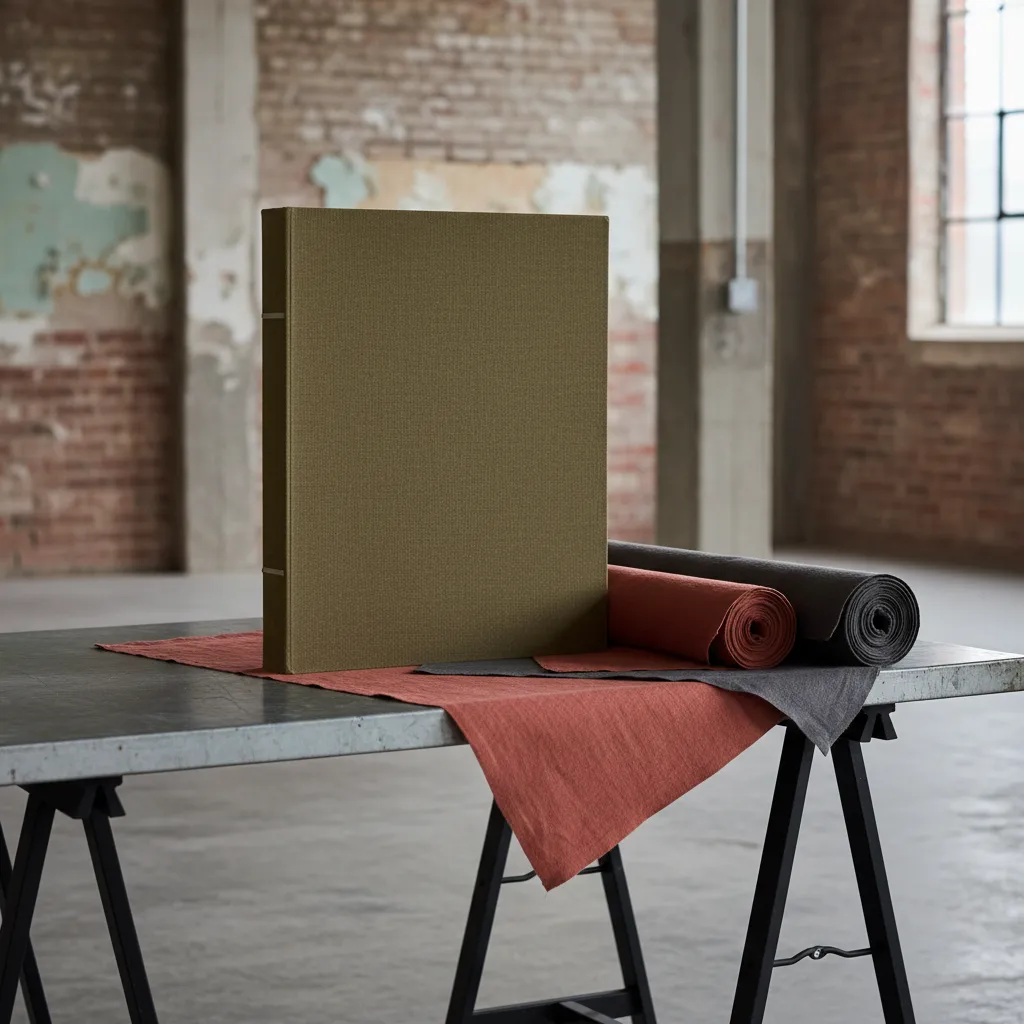
Bermondsey offers an atmospheric backdrop for thinking about scale: brick surfaces, warehouse forms and the changing openness of streets near the river. Use those contrasts as design prompts during an independently chosen walk. An olive panel with a rust accent could echo warmth against a restrained background, while charcoal might make the folio feel quieter. No particular shop or local supply is implied by that palette; it is a way to organise your own material preferences.
You might choose to spend part of the outing around Bermondsey Street, then take a separate riverside pause if it suits your day. Notice what happens when a large plain surface meets a small vivid detail. A narrow spine strip may be enough to give a broad cover character. Resist translating every interesting texture into the same object; the folio's scale already gives the chosen material a strong presence before you add any decoration.
Read the grain across a full panel
Ask to see enough of any candidate material to understand its directional character, with permission and without unrolling merchandise yourself. A small square may hide variations that become obvious across a large front cover. If you can obtain a sample, note which way it was oriented. At home, place it beside a full-size paper outline so the eventual relationship between thread direction, spine and panel remains visible while you compare alternatives.
A prominent weave can be a deliberate choice, particularly on a simple folio with few other elements. Check whether you like it running vertically when the object stands and horizontally when the cover opens flat. There may be no arrangement that looks identical in every position, so choose the view that matters most to the project. What feels like inconsistency in a tiny comparison can become a clear design decision when the intended use is specified.
Distinguish firmness from suitability
Materials described as coated cloth or buckram can have different finishes and handling qualities. Ask for the actual product description and the recommended covering method instead of treating a name as a guarantee. You are comparing a particular cloth for a particular construction. On a large folio, the backing, surface and behaviour around the joint may matter as much as the impression of toughness that first drew you to the sample.
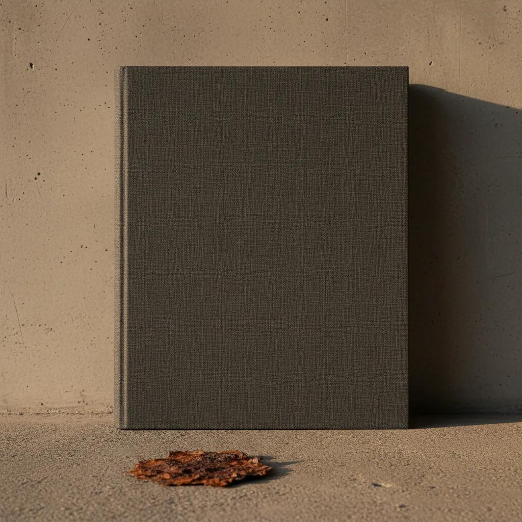
Try the material on spare board using the adhesive and drying procedure you intend to follow. Work with samples you own, keep the test manageable and observe it after drying. Examine the panel as well as the edge: a broad area can make an uneven result more noticeable than a narrow spine trial does. Follow relevant instructions, and do not improvise a treatment for valuable existing material based on a decorative project experiment.
A hinge is a separate design problem
The long joint deserves a deliberate mock-up. Set the board spacing according to a suitable construction plan and test how the model opens with its proposed lining. A cover that looks beautifully taut while closed may resist movement in a way you dislike. Look for a comfortable opening within the method you are using, rather than pulling harder or pressing the cloth until a doubtful structure temporarily lies flat for a photograph.
Skip thick, highly textured material when the joint test already feels crowded and the folio's main job is presenting fine sheets. You can choose a more restrained covering without losing the object's sense of substance. If the coarse texture is essential to the idea, reconsider the construction before committing. A clear decision about the joint is more valuable than an afternoon spent finding a second colour that distracts from a mechanical problem you can still feel.
Keep the label proportional
Large covers invite oversized titles, but a folio does not always need to announce itself from across a room. Build a paper label in the intended proportions and place it on the dummy. A modest label can give a plain panel a reference point, while a very broad one may divide the surface into awkward areas. Consider whether the folio will hold a stable collection or changing work before making the title permanent.
The inside deserves equal attention because it remains visible during presentation. Choose a lining that gives the contents room to be seen and assess it beside a representative sheet. If the folio holds original art or documents that require careful storage, get suitable material advice for their contact surfaces. The exterior colour decision does not establish preservation suitability. Keeping those questions distinct helps you enjoy the craft choices without asking a visually successful cover to prove something it cannot.
Nearby places and a workable finish
Use the Karpo APP to request nearby place recommendations around Bermondsey for an interest in book arts, paper and craft materials. Mention that you are considering a large presentation folio. You choose which recommendations interest you, how many places to visit and your own travel arrangements. Carry a folded project drawing and a material comparison sheet; the full-size dummy can stay at home unless transporting it is genuinely useful for a particular conversation.
Before committing to the cloth, bring the project back to its three views: closed, open and upright. Check that the panel, joint and spine still feel like parts of the same object, then let the strongest candidate stand without adding another accent. A successful large folio has presence through proportion and handling as much as through texture. The outing is complete when you can explain why the material belongs on this cover and what the final bench trial still needs to demonstrate.
Ask Karpo for more information.
Keep reading
- Shoreditch Comic Shop Crawl Planner: Murals to Manga
 Bermondsey Comic Shop Crawl Planner: Zines Under the Arches
 Clapham Comic Shop Crawl Planner: Charity Shelves and Common